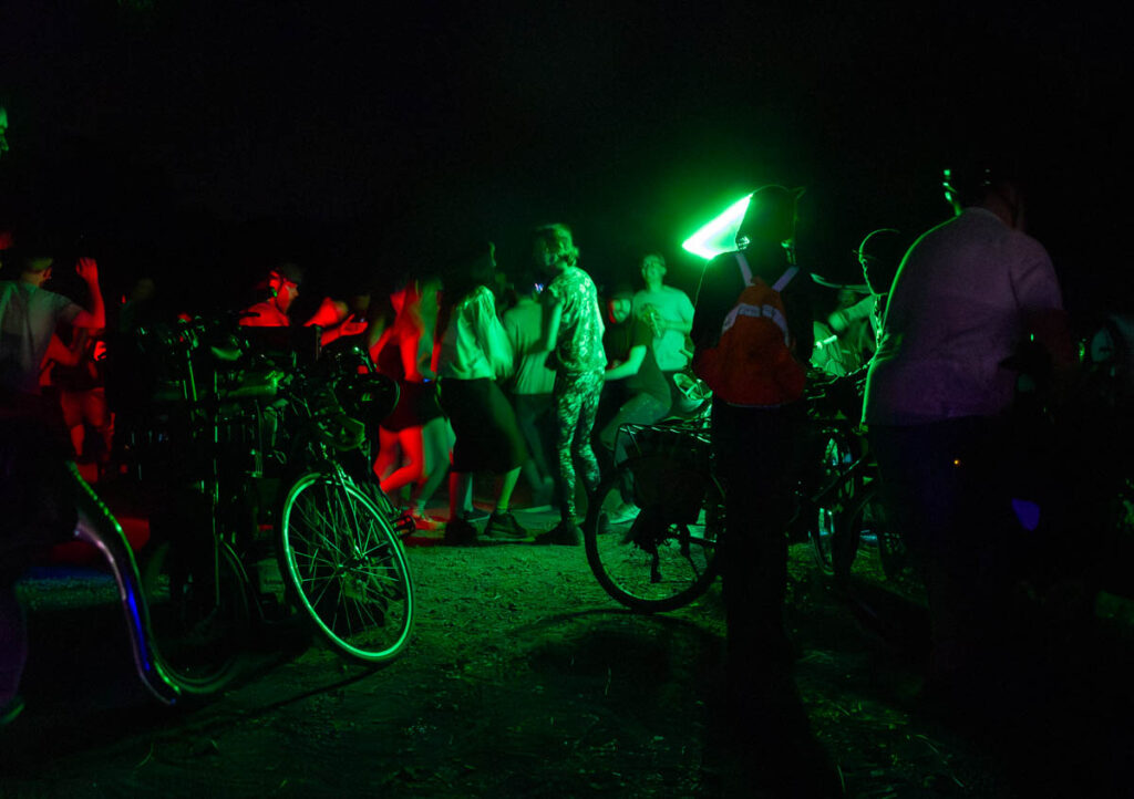
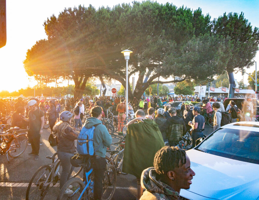
Bike Lab Researching cycling facilities, advocacy, and neighborhood change
  • Home
  • About the Bike Lab
  • Philosophy
  • Cities
    • Austin, TX
    • Charlotte, NC
    • Columbus, OH
    • Minneapolis, MN
  • Thesis

On the Waterfront

Map of Oakland showing the Metropolitan Transportation Commission's Communities of Concern. Deep East Oakland and parts of downtown and West Oakland are mostly dark purple (Highest concern). A few areas in Deep East, and much of Fruitvale is lighter purple (Higher concern). Most of the rest of the flatlands are light purple (High concern). The hills are uncolored (Low concern).

Compromised

Map of Los Angeles County census tracts, colored by percentage of Black population, overlain with Metro Bike Share system coverage.

Assumption of equity

Map of Oakland with existing, pending, and proposed Slow Streets highlighted. Four streets are marked as "Completed April 11", four more are "Pending Installation April 17", and approximately 20 more scatters around the city are "Other Streets to be Evaluated"

As I was saying…

Map of Oakland showing median income. All of East Oakland is shaded in red (less than $50K) or orange ($50-$100K). The hills to the north are in blue (>$200K) , while the areas further east and south trend to green and yellow ($100-$200K)

Disproportionality

Two maps of Valencia Street in San Francisco, showing a large increase in median household income from 2000-2018, and a sizable decrease in Hispanic population.

Bike infrastructure and displacement

Map of San Francisco showing Golden Gate Park and a selected census tract (67000) in the Outer Sunset

Error bar

The Douchebag Problem

Top down

Chart showing fatal crashes in Vision Zero cities from 2011-2018, gradually rising about 20%.

Revisiting a bad idea

1 2 3 … 5

The Bike Lab is an ongoing project of Totally Doable Consulting.

All content © 2020 Tom Holub unless otherwise noted.