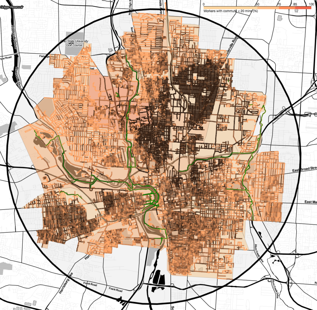
I’m working on scaling up the data analysis from the thesis, and I’m making some good progress, thanks to Folium. This is a really cool package for creating Leaflet.js maps from Python data, and writing them out to JSON, which means they can be used as interactive web maps. Or, what I’m going to be doing more of is grabbing the JSON/HTML output with PhantomJS and writing them out to image files, like the one included here (from Columbus, OH). This is one of the coolest-looking visualizations so far: census tracts are colored by percentage of workers with a commute less than 20 minutes (ACS 2015), and road segments are colored by access to jobs, attenuated by segment grade and circuity. Dedicated bike infrastructure (as reported by OpenStreetMaps) is colored in green.
I’m pretty close to being able to run this on an arbitrary number of cities: just need to make the code a little more robust.