
Austin, TX
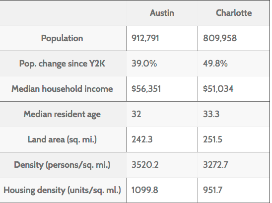
Austin is one of the fastest-growing cities in the South; its population rose 39% from 2000-2014, from a combination of migration and city expansion. Its primary industries are technology and music. It’s also the state capital, and houses the main campus of the University of Texas, which enrolls over 40,000 students.
Thoughts from Austin
Wrapping up Austin
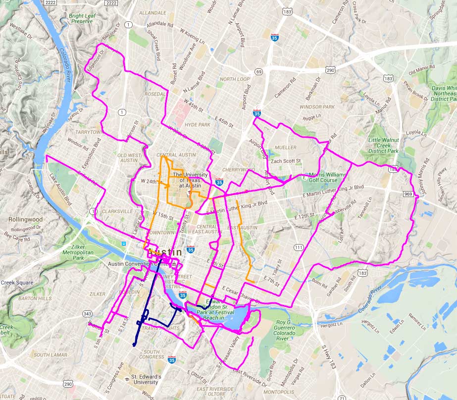
We covered a lot of ground in Austin; 222km, over double what I did in Charlotte. It’s unfortunate that UT Austin (more or less in the center of this map) was not in session; you can see how much of the network is oriented towards the university. That’s a fairly fundamental problem for a summer research project on bike transportation–UMN and Ohio State will also be out of session when I visit Minneapolis and Columbus. I’ll have to see if I can manage to get back when the students are around.
Exclusions and “invisible cyclists”
The most interesting finding of my first field trip came as I was riding through East Austin. The Southern Walnut Creek path is a freeway-style recreation path which bisected the neighborhood without connecting to it or addressing the issues of the residents. I believe that bike advocacy often takes a narrow and hegemonic view of what good streets look like, and that much advocacy work loses sight of the core goals of street projects (increasing safety and reducing car trips) in favor of projects which symbolically reassert cyclist privilege.
Austin Transportation Department
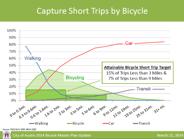
I met with folks from the Active Transportation department of the City of Austin, and they were super-helpful. One of the more interesting points they raised is the concept of “attainable mode share.” Bikes will never carry a large percentage of long trips, but for intermediate trips of 1-2 miles, the bike can be the preferred option. Also, a new flaw with the ACS mode share data: City boundaries change.
Bike Austin
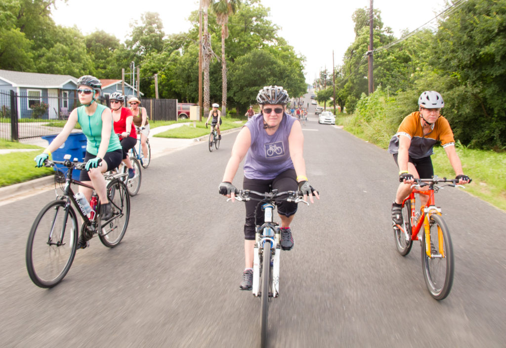
My impression is that Bike Austin’s strategy is to normalize cycling. For many years in the U.S., cycling was an exceptional activity, generally not viewed as something that could be integrated with daily life. Leading a group ride on a city bike, in street clothes, and without a helmet is more than a collection of personal choices: it’s a statement about a different way to conceptualize cycling in the city. You’re a lot more likely to ride from the brew pub to the café if it’s OK to jump on any old bike in the clothes you happen to be…
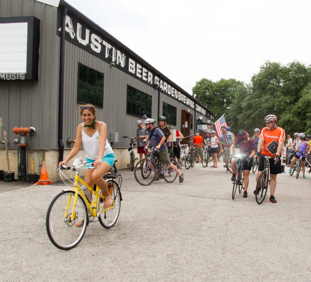
Spring Fling
From the bike rental place we were headed out to Bike Austin’s Spring Fling ride. This was a slightly more organized social ride than the ones I’d done in Charlotte; a $10 entry fee got you a beer at the start, coffee at the midpoint, and beer at the finish, all from local businesses who support cycling. Like the social rides in Charlotte, the idea was to have a non-lycra, low speed, fun group ride with a focus on seeing different parts of the city.
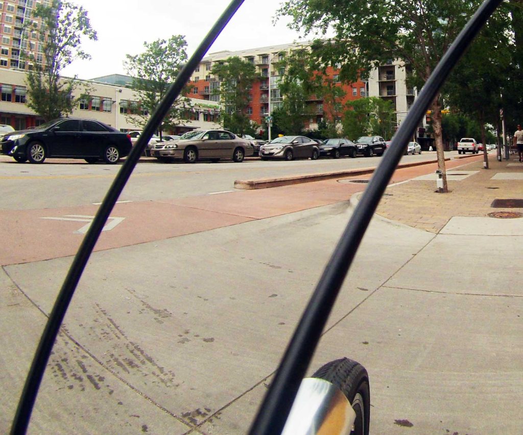
Protected bike lane
We rented bikes from an operation located on one of Austin’s protected bike lanes, and rolled out to survey the streets. My personal opinion on this facility: Meh.
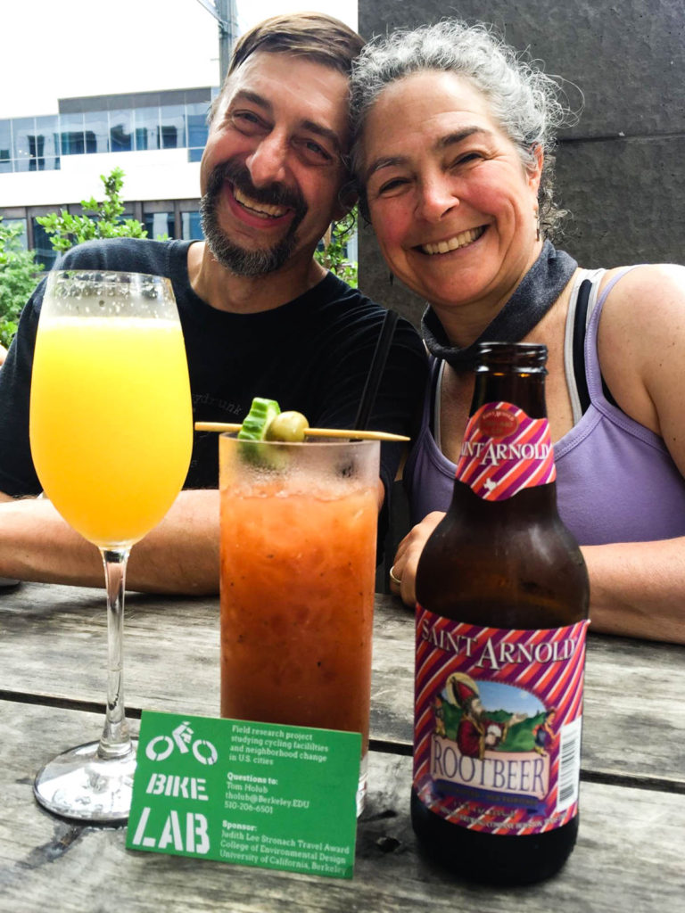
Research assistants
I was joined in Austin by two research assistants: my wife and our friend April. We headed out to East Sixth Street to discuss the logistics of doing surveys, and to conduct an evening count in the district.
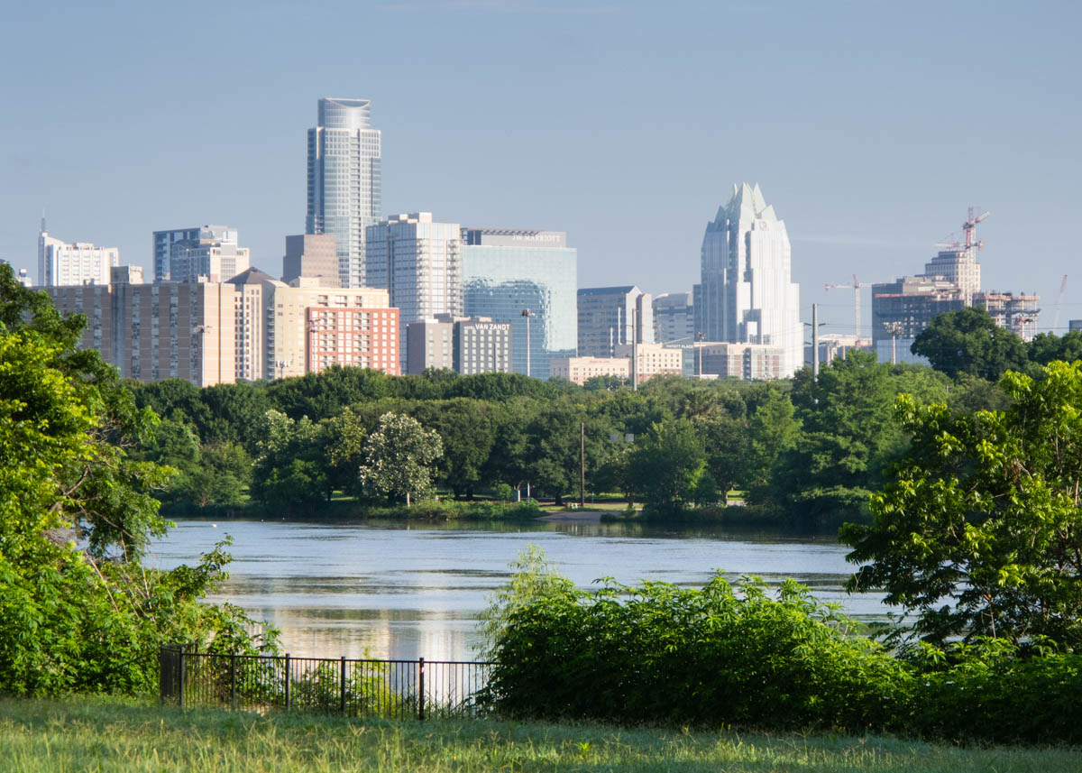
Landing in Austin
Arriving in Austin, I did a bike count at a Portlandia-style coffee roaster in East Austin. Austin’s industrial expansion, along with the continued development of the music district along nearby East 6th Street is clearly driving changes to the neighborhood, and some of those changes are associated with cycling; I was just down the street from the pedicab garage.
Comparing cities
A question I’m trying to answer is, why are utility cycling rates higher in some U.S. cities than others? It’s tricky to investigate for a number of reasons. The first is simple: Our data sucks. The second is complex: It’s just a difficult question. Utility cycling rates are driven by countless factors: the density and nature of the built environment, the character of the street network, weather, demographics, socioeconomic status, culture, and more. Each city has its own unique combination of these factors; extracting causal relationships from the paltry data is quite challenging.