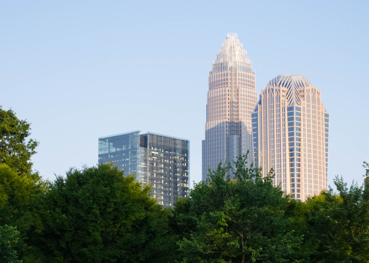
Charlotte, NC
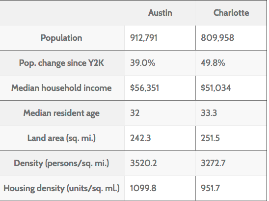
Charlotte is one of the fastest-growing cities in the country; its population rose almost 50% from 2000-2014, from a combination of migration and city expansion. It has become the second-largest banking center in the country after New York City. According to the American Community Survey, it has one of the lowest commute biking rates in the country (0.2%).
Thoughts from Charlotte
Comparing cities
A question I’m trying to answer is, why are utility cycling rates higher in some U.S. cities than others? It’s tricky to investigate for a number of reasons. The first is simple: Our data sucks. The second is complex: It’s just a difficult question. Utility cycling rates are driven by countless factors: the density and nature of the built environment, the character of the street network, weather, demographics, socioeconomic status, culture, and more. Each city has its own unique combination of these factors; extracting causal relationships from the paltry data is quite challenging.
Golden Age
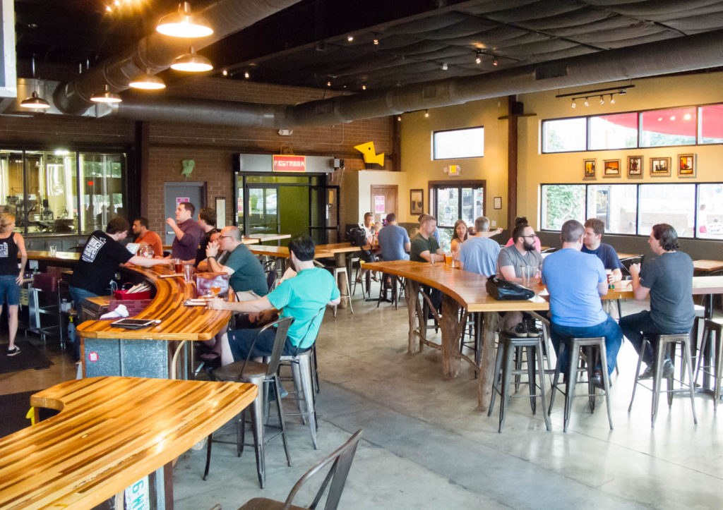
On Friday night I did a bike/ped count at the Birdsong Brewery, which I’d been told was the place to see lots of bikes. The count turned out to be as just as fruitless as the others I’d done (a total of four bike riders in two hours), but the trip was fruitful. Even though I’d only been in town a few days, there were several people at the bar who I had already met. After a while, the group checked Strava to find their other cycling friends, who turned out to be at a different brewery.
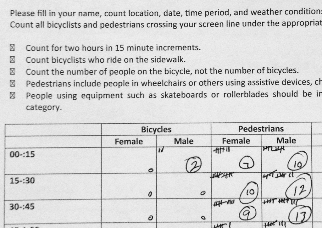
Counts
I’m doing bike and pedestrian counts at selected parts of the city transportation network. The data that exists on cycling volumes in different cities is very spotty; the national American Community Survey data only covers work commute cycling and isn’t spatially located within the city. Unfortunately, in Charlotte the location didn’t seem to matter much; in none of the places I conducted a count in Charlotte did I see more than 5 bikes in a 2-hour period.
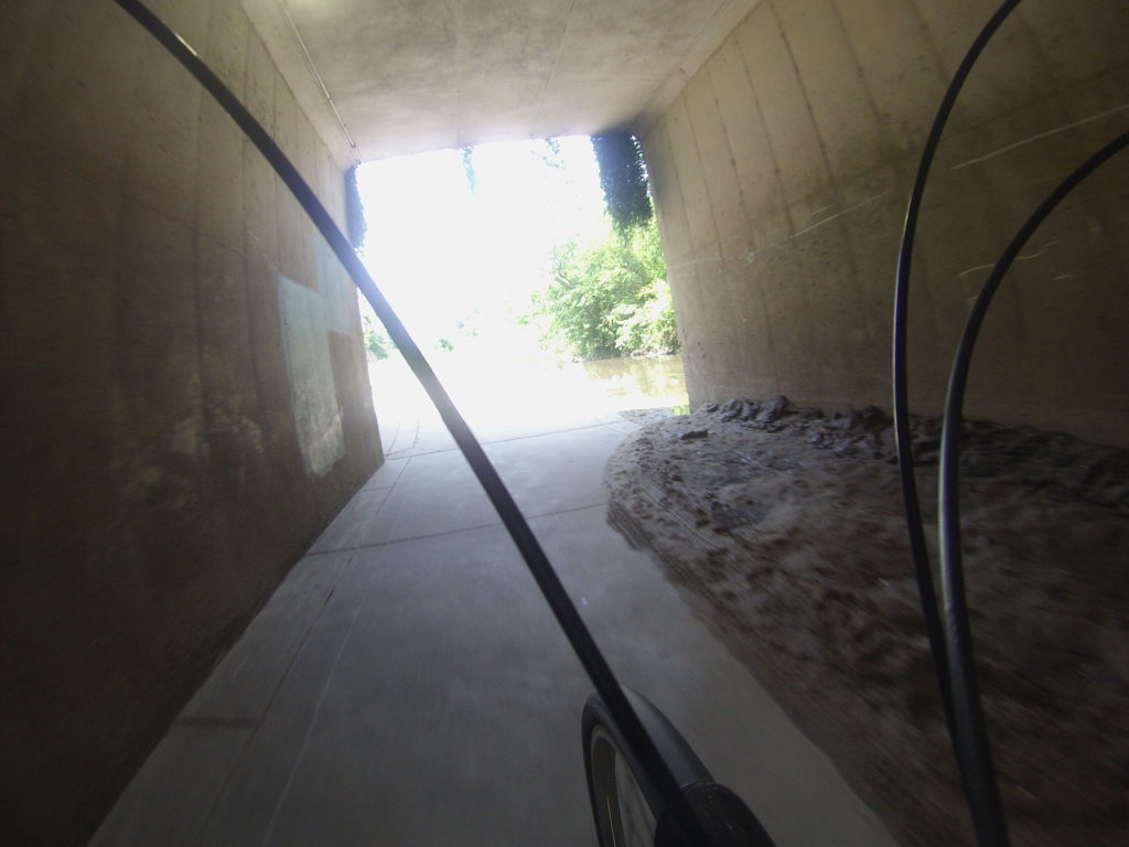
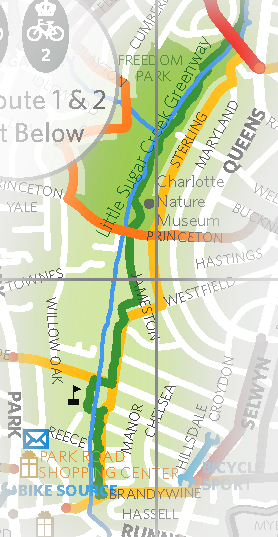
Greenways
Charlotte is putting a lot of effort into developing greenways with multi-use paths. For utility cyclists, the creek paths are a mixed bag. One thing I immediately noticed in surveying them is that they’re poorly connected to the street grid. They’re also not maintained as if they are part of the transportation network.

Charlotte DOT
After the breakfast meetup on Friday, I rode in to the government center with Matt Magnasco, one of the designers for Charlotte’s Department of Transportation. There, I met with matt and his colleague Ben Miller, also a cyclist. Matt and Ben do most of the design on bike-related projects in Charlotte. Charlotte does not have a funded bike infrastructure program. The Charlotte city council adopted a Complete Streets policy some years ago, but clearly hasn’t provided funding for it.
Methods
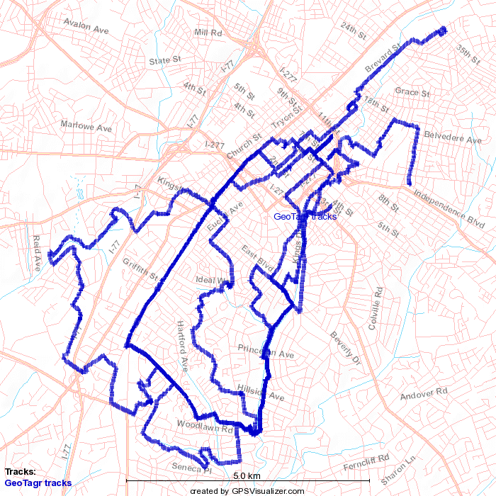
There are two reasons I’m visiting cities to ride the infrastructure. One is that I want to get a better sense of the subjective experience of the place; I feel like I can’t really understand a city unless I’ve ridden through it. The other is that I want to identify specific issues with the infrastructure. I’d like to get to a measure like “value over replacement facility” which counts mileage only for clearly bike-oriented improvements, and discounts those facilities which include hazardous conditions.
Socializing
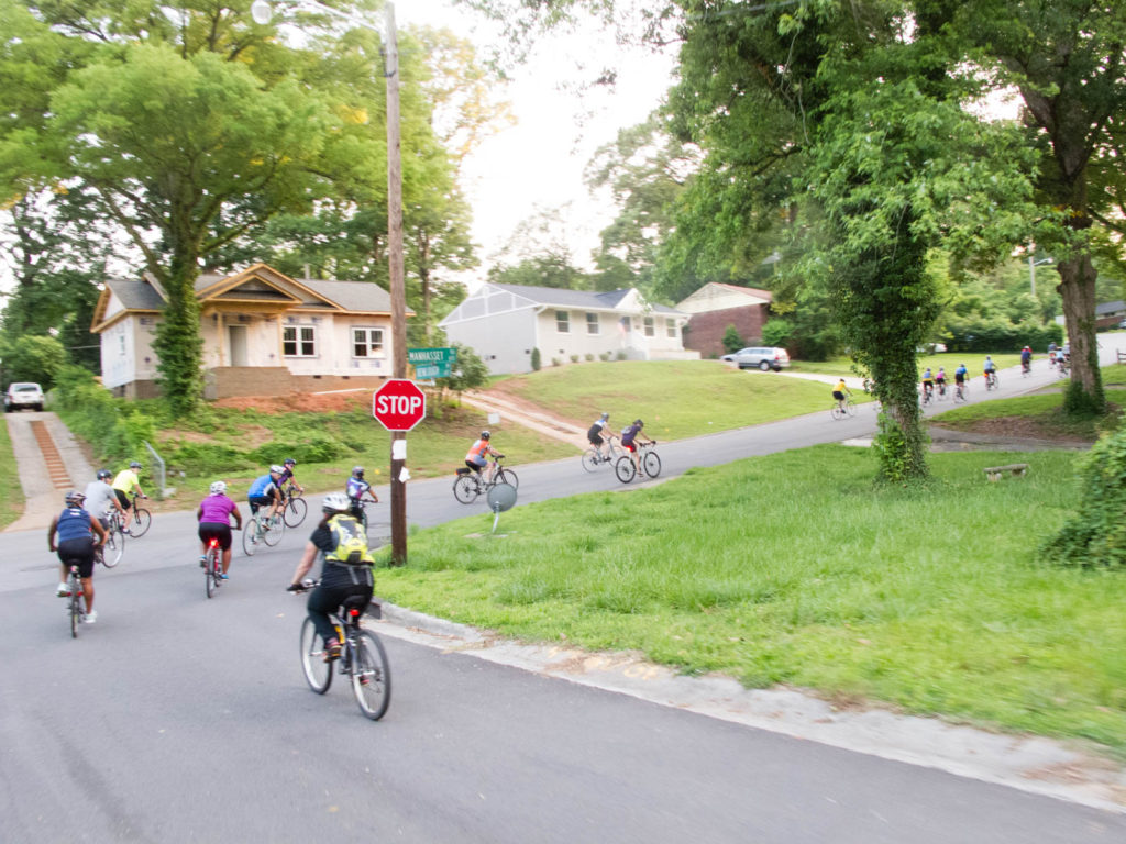
There’s not quite an equivalent of Charlotte’s social rides in the Bay Area. I participated in the Thursday Night Lights ride (a slow-paced, no-drop, baggy-pants ride), and then joined a group for their traditional Friday morning breakfast meet-up. The community is pretty tight-knit.
Natural bikeways
One of the things I noticed while riding around Charlotte was that certain streets, or collections of streets, are what I would call “natural” bikeways. These are relatively flat roads which carry relatively low traffic volumes for their width, and which allow you to ride for significant distances with limited major intersections and limited stops. The concept of the natural bikeway has several implications for my research.
Charlotte Spokes People
The first person who responded to me about meeting up while I was in Charlotte was Pam Murray, co-founder of the Charlotte Spokes People. Her philosophy is that education should be the primary tool to get people riding, and she organizes a number of social rides, which are an important part of cycling culture in Charlotte.