
Columbus, OH
Columbus, Ohio is one of the fastest growing cities in the north, with population growing by 17.5% from 2000-2014. It is the largest city in Ohio, and houses both the state capitol and the Ohio State University, with enrollment of over 50,000 students.
Thoughts from Columbus
Auto-generating maps
I’m working on scaling up the data analysis from the thesis, and I’m making some good progress, thanks to Folium. I’m pretty close to being able to run this on an arbitrary number of cities: just need to make the code a little more robust.
Distance thresholds
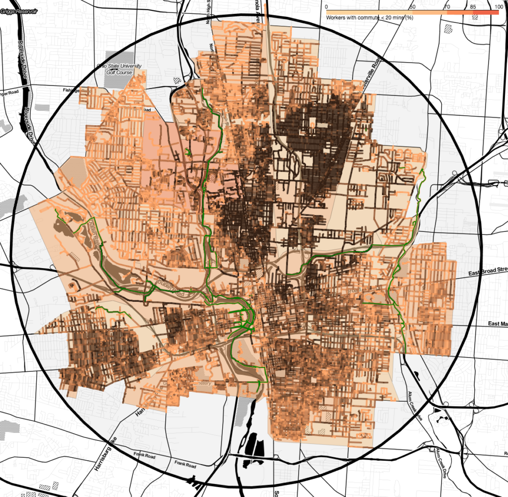
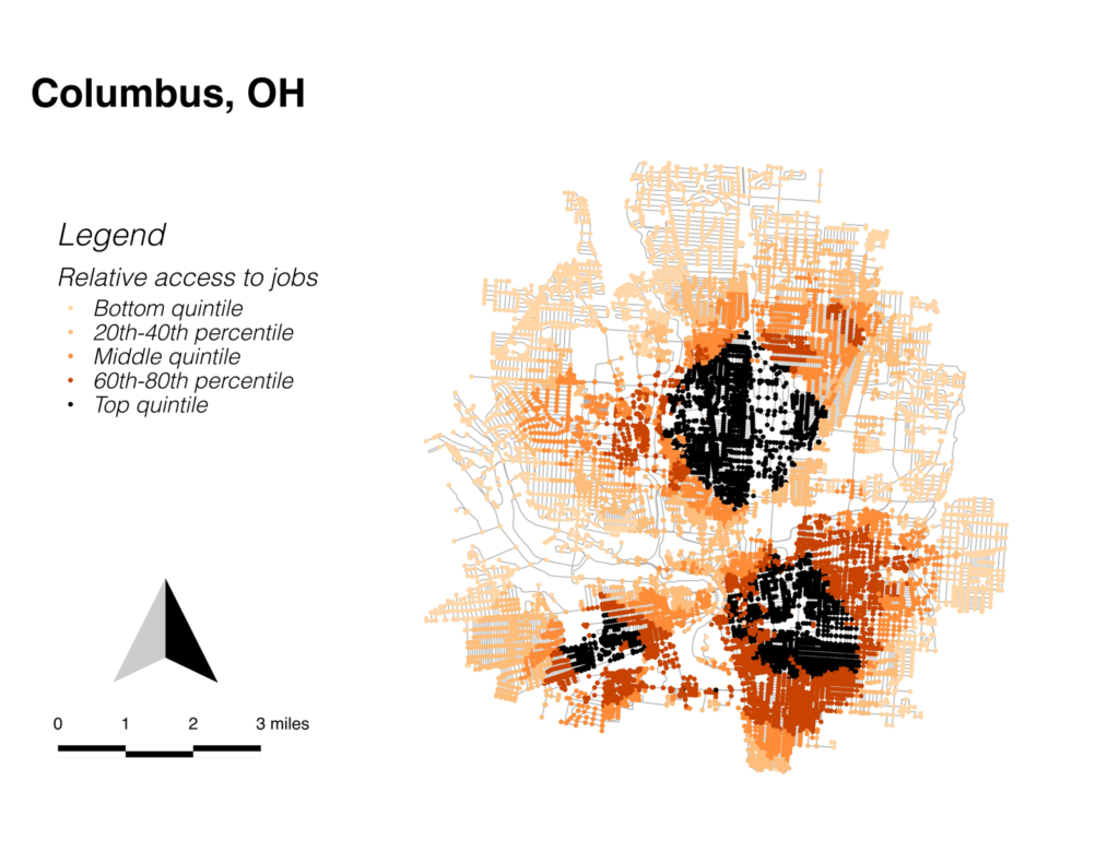
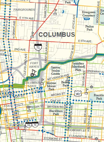
After looking at the job connectivity maps, I was curious to explore the idea that densities above a certain level led to walking more than cycling. I don’t have enough data to make a definitive statement, but I did find an interesting phenomenon related to connectivity in Columbus. Columbus has three disconnected zones where jobs are very close, broken up by areas of low job access.

Roads vs. streets
Urbanists like to distinguish streets from roads. The somewhat distasteful neo-liberal conception is that roads exist to connect productive places, and streets exist as a platform for building wealth. A similar dichotomy exists with bike infrastructure; bike roads get us from place to place efficiently, and bike streets are interesting places to be.
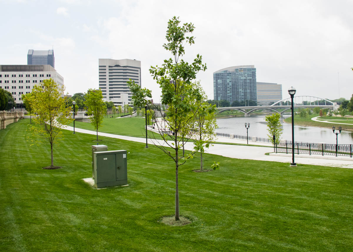
Scioto River Valley
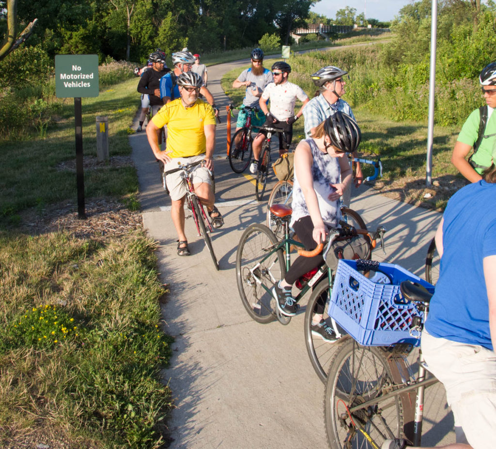
Columbus is the host of the Tour of the Scioto River Valley (TOSRV), one of America’s longest-standing large group rides. TOSRV makes the claim, with some credibility, that its popularity led to the original U.S. bike boom back in the 1970s. So, social riding is part of the culture around Columbus, and I was able to hook up with the regular Tuesday night social ride. The leader of the ride, Ray George, is one of the founders of Yay Bikes!, and he was more than happy to talk about the organization.
Subaltern cyclists
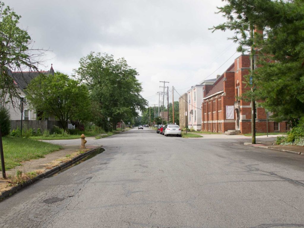
Heading towards downtown Columbus from Old Towne East, you see a tall building with a sign that reads “Motorists,” which seems to emphasize the transportation hierarchy in town. There seems to have been some nasty conflict between bike groups here, and one thing we know about subaltern groups is that there is a tendency towards infighting and competition amongst themselves. Instead of banding together to fight for their interests, they can fall into disputes over goals and methods–especially, whether to work within the system or to disrupt it.
Indigenous bikeways
I’m thinking of using the term indigenous instead of natural to describe the existing infrastructure of a city prior to the construction of any bike-specific facilities. The OED defines indigenous as “Originating or occurring naturally in a particular place,” which I think captures the idea I want to get across. Indigenous bikeways aren’t entirely natural, but they exist (or don’t) based on decisions that were made decades or centuries ago.
The term also has a slightly unsettling connection to colonialism which I actually think is good, because I think urbanism often has a slightly unsettling connection to colonialism, or more specifically…
Bikeway taxonomy
There have been a number of different attempts to categorize bikeways based on different criteria, some related to the facility design, some related to its users. I’m not really happy with any of them. I’m working on developing a taxonomy that could improve our discussions about bike facilities.
Columbus as “Smart City”
My Facebook feed is atwitter with urbanist friends congratulating Columbus for winning the USDOT’s Smart City Challenge, getting $50M in federal funds for so-called “smart” transportation.
My take: No thanks.