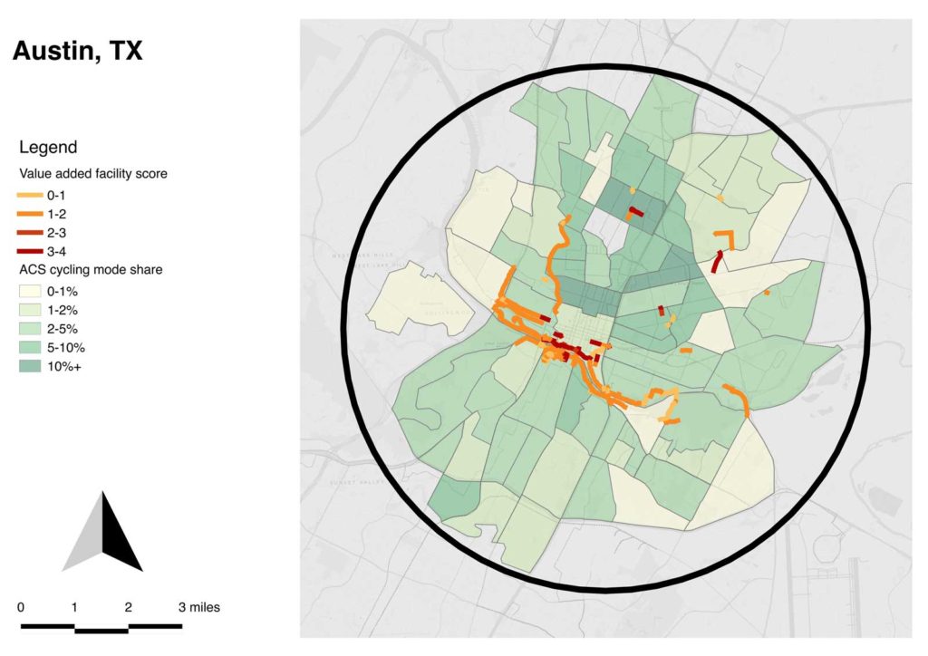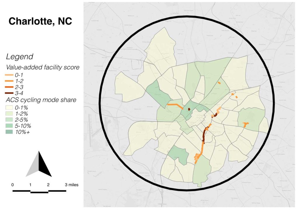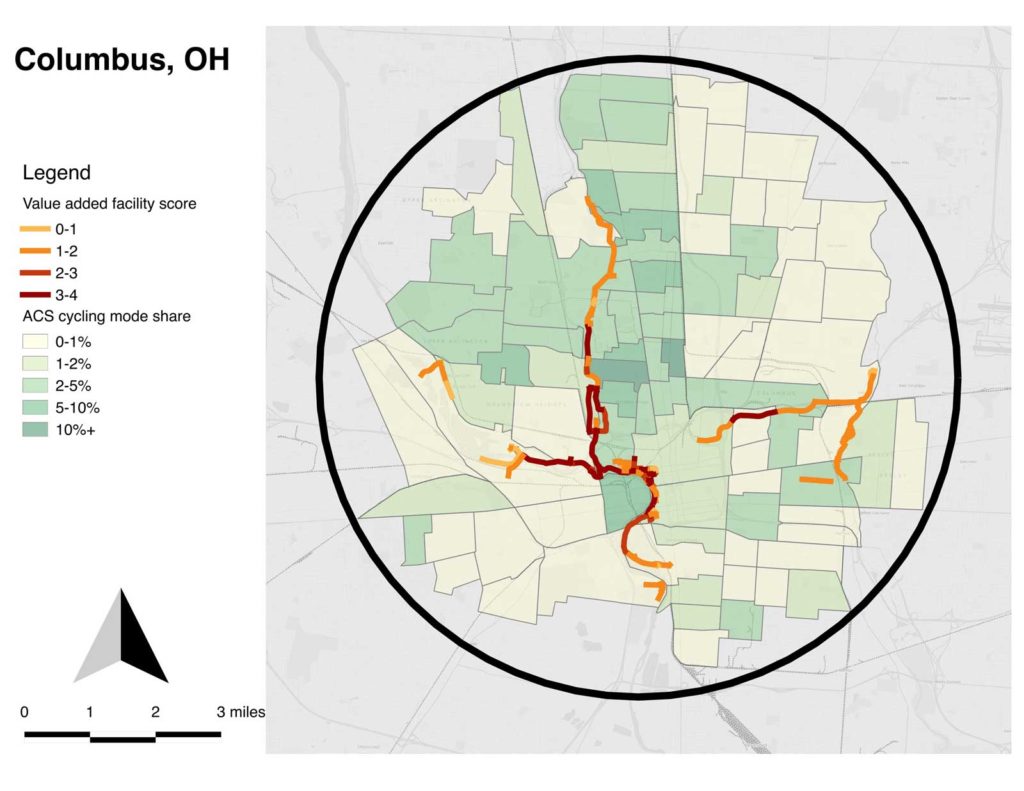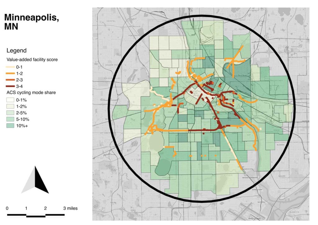
Combining my concepts of target area and value-added facilities, I developed maps for each city which select the circle of census tracts near the central city which have the great number of commute cyclists (by the 2015 ACS 5-year estimates). Each of these maps is equal area and uses the same scale.
One thing that’s visibly notable is the relatively weak connection of value-added facilities to cycling rates, by census tract; only in Columbus are they well-connected. Part of what I conclude is that cultural factors and the indigenous qualities of the street network are more important than value-added facilities in cycling mode choice.
One of my summer projects is to try to re-generate these in Python. I was trying to do all the GIS work in Python, but when it came to final output, I ran out of time and wound up having to export shapefiles and do the maps manually in QGIS. That’s why they’re not perfectly identical. Once it’s working in Python, I should be able to auto-generate the circles and the census tract data for any city in the U.S.
The methodology is potentially interesting for other kinds of analysis; I’m using bike mode share data, but you could just as easily optimize for any other census data, like median income, non-white population, educational attainment, etc. It could be a useful way to make urban areas more comparable for data analysis.