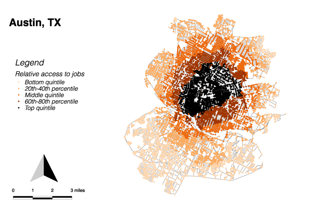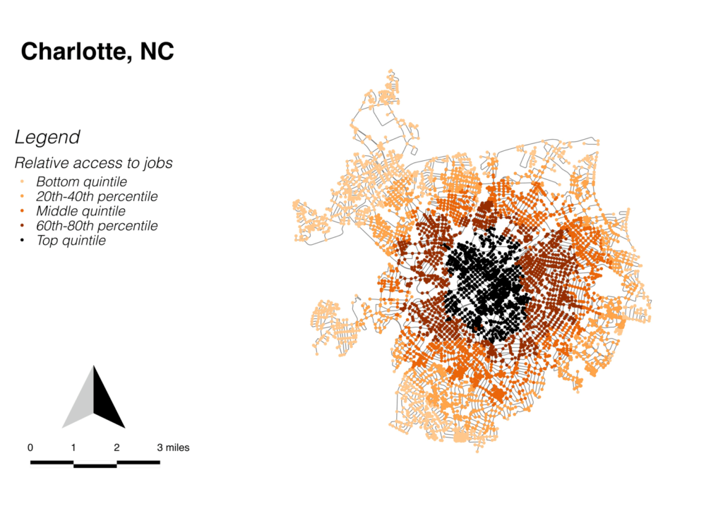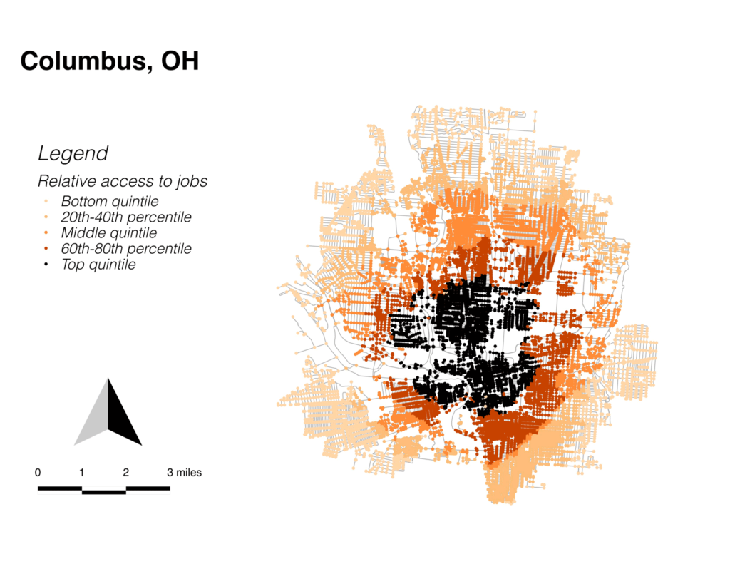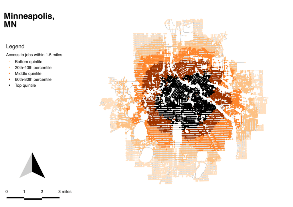
One of the factors I’m trying to measure in valuing facilities is their usefulness; do they actually go where utility cyclists want to ride? I was unable to get BikeScore data (which looks pretty questionable anyway), so I had to build my own metric around it. One of the factors I used was access to jobs along the cycling network (with cycling network data obtained from OpenStreetMaps via Geoff Boeing’s awesome OSMnx tool). These maps show access to jobs within 1.5 miles from each intersection in the city; cycling routes through and near the dense areas here were scored higher.
One of the interesting things about these maps is how they visualize the density of the street network. The difference between Minneapolis’ densely connected street grid, and Charlotte’s broken-up and sparse network visualize really substantial differences in the indigenous conditions for cycling in the two cities.
These maps are using the same extents as the target area maps (the circle extenst rather than the census tract extents).