Data

A wide mural on a fence reads "ANACOSTIA". On the left side of the mural are images of Washington, D.C.; the U.S. Capitol, the Washington Monument, and cherry blossoms. A black child holds a hand-made sign with dripping paint reading "I (heart) DC". On the right side of the mural, three Black musicians play (a guitarist, trombone player, and keyboard)

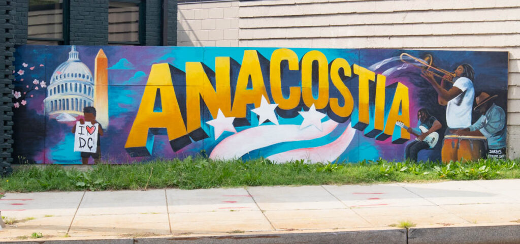
The Bike Lab visits Anacostia

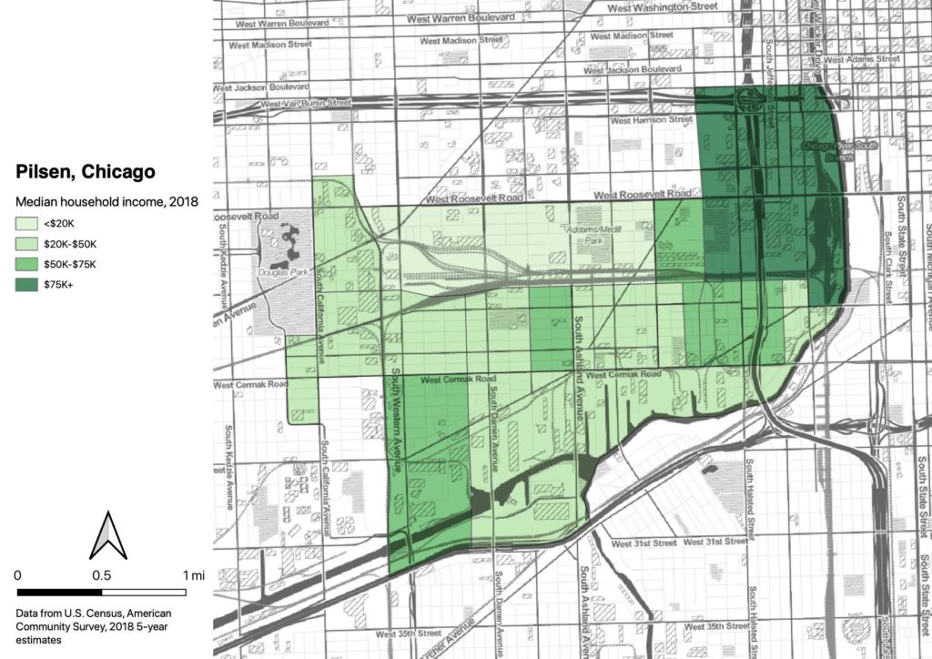
In my series on neighborhood change along streets named for MLK, Washington, D.C.’s Anacostia neighborhood was identified as notable; between 2000 and 2017, Anacostia saw Black population increase, while median income also increased. That unusual pattern could represent development without displacement, the Holy Grail of community and economic development. The bicycle is the Bike Lab’s preferred data-gathering tool, so on a visit to DC, I had to roll through the neighborhood to get a better sense of it.

Racially-biased policing in Oakland (updated with 2019 data)

The Oakland Police Department is legally required to provide racial data on police stops. But they’re not required to make it easy. But they finally released their report.

We don’t have detailed public data on where the stops are occurring, only the police beat. I did some hacky stuff to estimate the racial composition of each police beat using Census data, and tested whether the stops were proportional to the racial makeup. As you might guess, the answer is “no.” In 2019, the problem was marginally better, but it’s still a problem.

Collection of Chicago (North Lawndale) maps

I’m working on a series of maps of Chicago’s North Lawndale neighborhood. I’m just going to drop a bunch of drafts into this post to share with the team.

Map of Chicago, showing Burgess' concentric-circle zone model on top of the FHA redlining map for Chicago. Nearly all of zone 2 (zone in transition) and zone 3 (zone of workingmen's homes) were redlined. Zone 4 (residential zone) is mostly yellow, and zone 5 (commuters zone) is mostly green and blue.

Burgess concentric circle map in GIS

I’m going to be doing some mapping for a project from Equiticity, and one of the themes will be historical spatial inequities in Chicago. This got me thinking about the highly influential concentric-circle city development map drawn by Ernest Burgess (Chicago School of Urban Sociology) in 1925.

Surprisingly I couldn’t find a usable GIS representation of his drawing. So I decided to work on my georectifying skills and put one together.

You can see how Burgess’ racist ideas led directly to racist housing policies.

Map of Los Angeles County census tracts, colored by percentage of Black population, overlain with Metro Bike Share system coverage.

Assumption of equity

I see advocates assume that the projects that they advocate for will address issues of historical inequities. A thread on distributing bikes in LA led me to investigate whether LA Metro bike share is equitably distributed. Bike share does not reach the Black areas of the city at all; in fact, there’s not a single bike share station located in a census tract that is even 25% Black.

Displacement and density

After doing some crunching this week on data about rapidly-gentrifying Valencia Street in San Francisco, and finding that residential density is actually dropping in the neighborhood despite new housing construction, I wondered whether the same phenomenon could be found elsewhere in the country. I didn’t have to wait long for another case study, as Lynda Lopez and a number of other peeps I follow from Chicago posted about Mayor Lori Lightfoot’s ill-considered statement about “vibrancy” in Pilsen, a gentrifying neighborhood west of the Loop. It turns out that the demographic dynamics in Pilsen are very similar to Valencia Street, and they challenge the claim that infill development is a climate solution.

Scroll to Top