Burgess concentric circle map in GIS

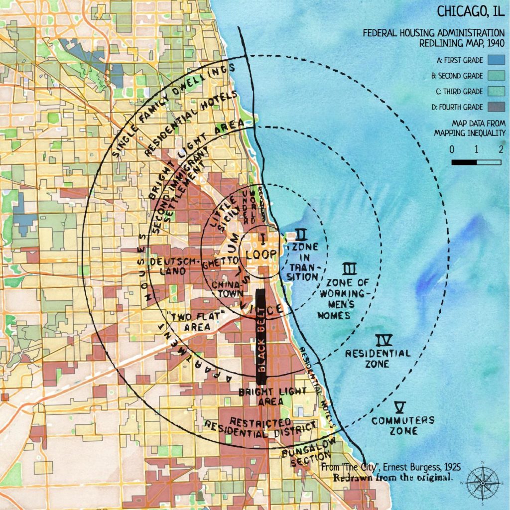
I’m going to be doing some mapping for a project from Equiticity, and one of the themes will be historical spatial inequities in Chicago. This got me thinking about the highly influential concentric-circle city development map drawn by Ernest Burgess (Chicago School of Urban Sociology) in 1925.

Map of concentric circles, using Chicago as a model for urban development. In the center, 1 Loop. Then 2, Zone in transition (includes "slum", "vice", "chinatown", "ghetto", "little Sicily", "Underworld", "Roomers". Then, 3, Zone of workingmen's homes,  which includes "Two Flat area", "Deutschland" "Second immigrant settlement", and "Black Belt". Then, 4, "Residential zone", which includes "Bright light area", "Restricted residential district", "Apartment houses", "Residential hotels", "Single family dwellings". Then, 5, Commuters Zone, "Bungalow Section"

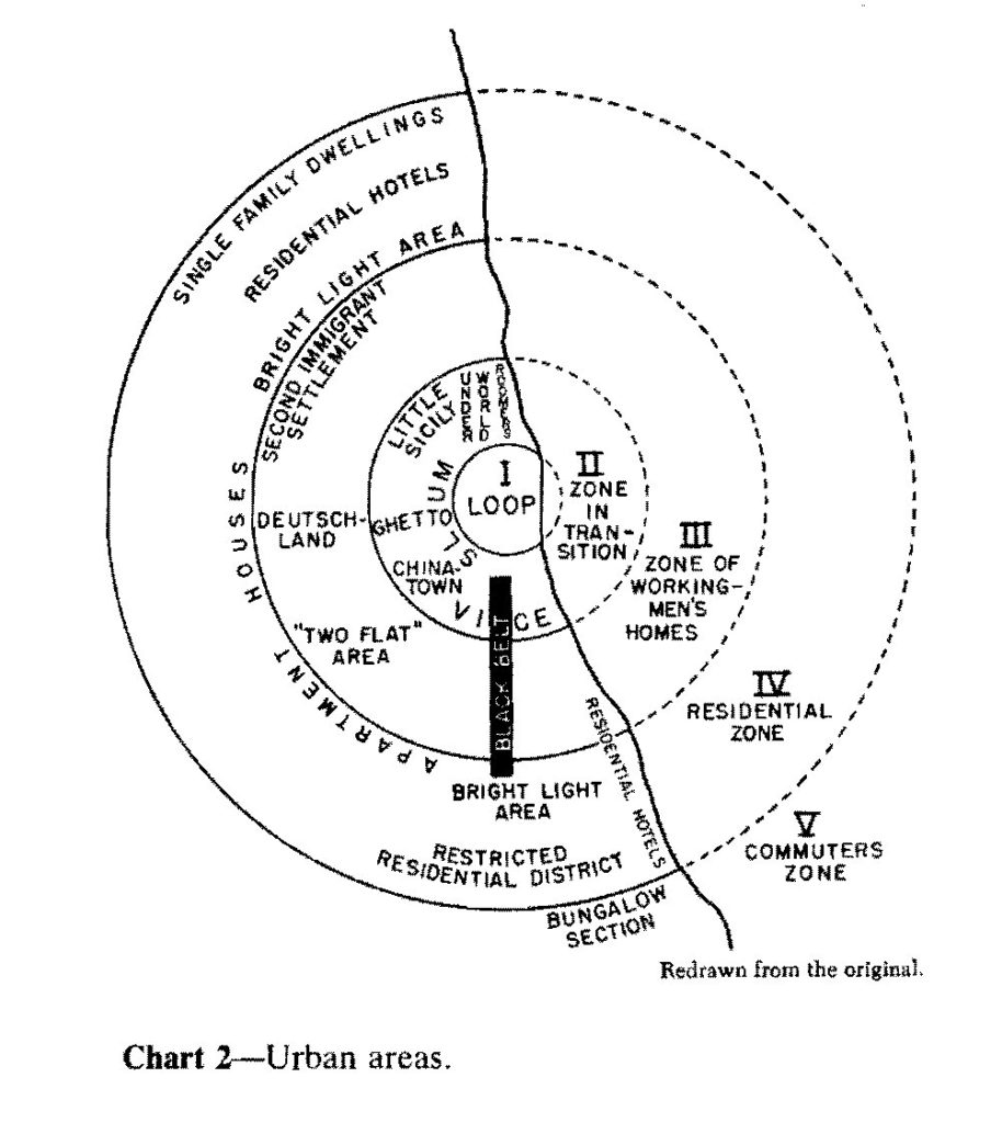
Burgess’ idea was that the city grew this way organically; a central business district with commerce and industry, surrounded by a set of ethnic ghettos and slums, which in turn are surrounded by zones for wealthier (and presumably whiter) people. He explicitly ignores the role of policy and racism in the divisions he highlights on the map.

It’s painful to read his eugenicist text today, and it’s distressing how his model is usually presented without criticism of the role it played in encouraging racist policies like redlining.

I wanted to map this for Chicago, and surprisingly couldn’t find a usable GIS representation of his drawing. So I decided to work on my georectifying skills and put one together.

Here’s the model, fit onto the 1940 redlining map of Chicago. You can see how Burgess’ racist ideas led directly to racist housing policies.

Map of Chicago, showing Burgess' concentric-circle zone model on top of the FHA redlining map for Chicago. Nearly all of zone 2 (zone in transition) and zone 3 (zone of workingmen's homes) were redlined. Zone 4 (residential zone) is mostly yellow, and zone 5 (commuters zone) is mostly green and blue.

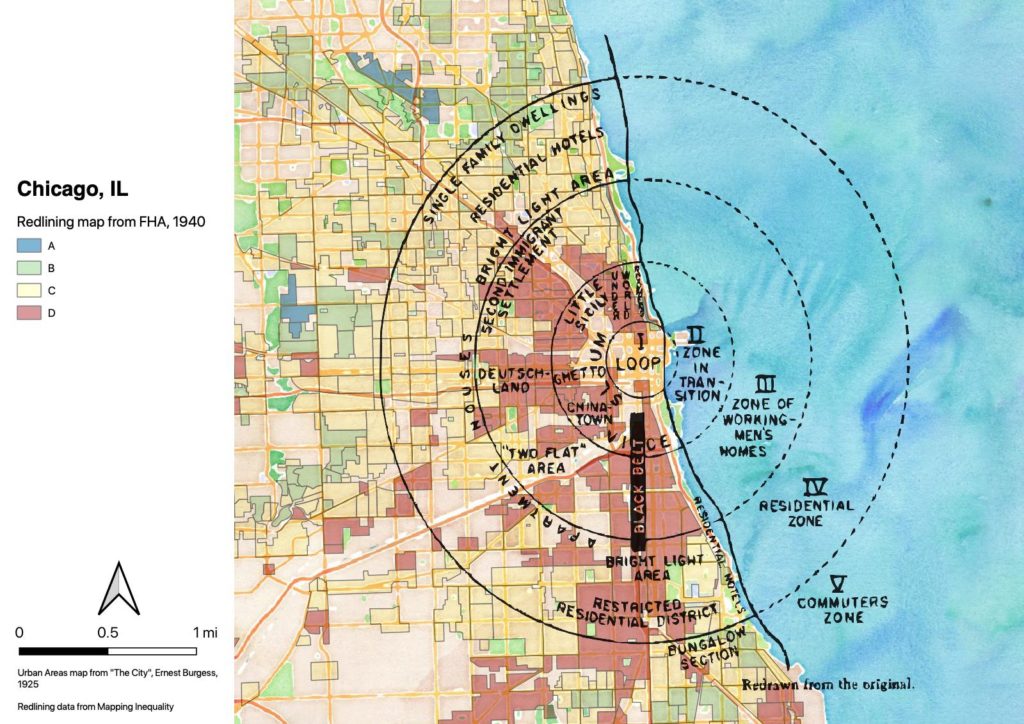
It’s not coincidence that we disinvested in the central city in Chicago (and all U.S. cities). This map told banks where to invest; out in the suburbs and exurbs, where Black people were not allowed to live because of racially-restrictive housing compacts.

Anyway, I created a georectified version of the concentric circle image, with a polygon layer for each of the circles. Someone else may find it useful.

Geopackage of Burgess concentric-circle model, with raster image and polygon layers

Edit to add: I was looking at this map and thinking it really needed a hand-drawn treatment. So, version 2:

Map of Chicago, showing Burgess' concentric-circle zone model on top of the FHA redlining map for Chicago. Nearly all of zone 2 (zone in transition) and zone 3 (zone of workingmen's homes) were redlined. Zone 4 (residential zone) is mostly yellow, and zone 5 (commuters zone) is mostly green and blue.

5 Responses to “Burgess concentric circle map in GIS

  • Hello!

    I was just looking for a map like this – I am a master’s student and am presenting my thesis connecting segregation/gentrification to air pollution in Chicago and was wondering if I could use this map (and cite it in the slides) with your permission. I am studying at the Vienna University of Economics and Business in Austria (but am originally from Chicago) and it would be helpful for explaining the layout of the city before I get into the spatial analysis/regression results.

    Thanks,
    Taylor

    • Please, feel free.

      Note that the original Burgess map has no scale so the scale here is an estimate. It also got slightly ovalized as I was trying to use the shoreline to georectify the image.

      Good luck with your program.

  • Awesome, thank you! Will reference this page/URL – and let me know if there is anything else you’d like me to note.

  • Hi! I’m an undergraduate student currently doing research on urban segregation in America, and was wondering if I could have your permission to use this diagram in my essay and cite it accordingly. It would be really helpful in illustrating my point on disinvestments in redlined areas as a result of institutions and planning policies, as you’ve mentioned in your post too. Please let me know how I should cite your website / image. Thank you!

    • Please, feel free to use it. I’m not up on current standards for referencing web resources but you can cite me as Holub, T.

Leave a Reply Text

Your email address will not be published. Required fields are marked *