MLK Way part 4: Displacement
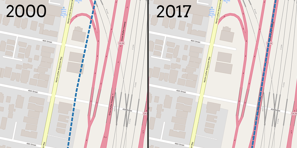
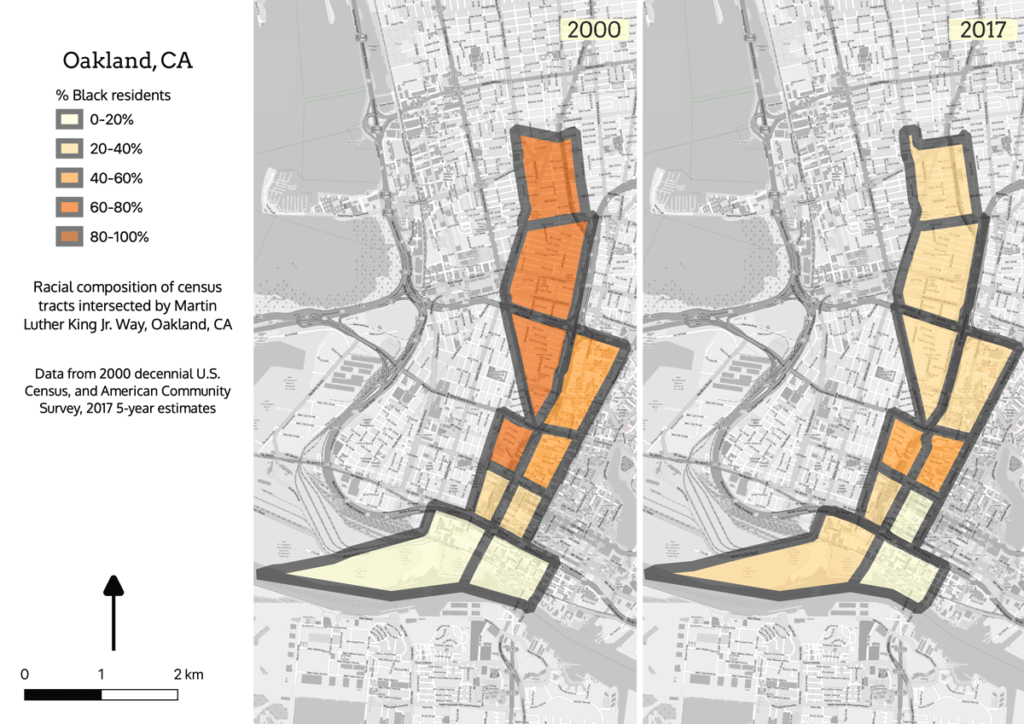
The Black Panther Party got its start on Oakland’s Martin Luther King, Jr. Way (then named Grove Street). It was partly fear of the Panthers which led the city to make Grove/MLK the boundary where the elevated BART tracks and the 980/24 freeway would be routed. Anyone living there today can tell you that the neighborhood is one of the most rapidly gentrifying areas of Oakland, which is why it shows up in the group of cities where MLK Way is undergoing displacement: a decrease in Black population and an increase in White population coupled with an increase in median income and other markers of socioeconomic change. This is the most common case in the data set, with 15 cities meeting the criteria.