mlk

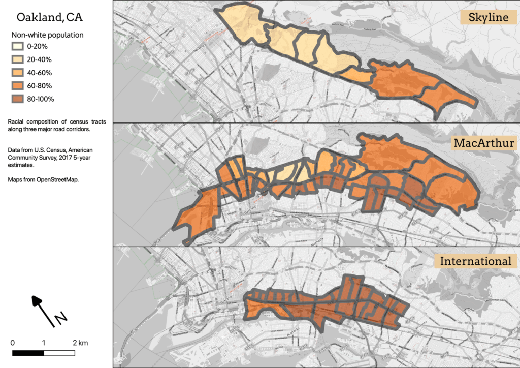
Three maps, showing non-white population in Oakland along International, MacArthur, and Skyline Boulevards.

MLK Way: Conclusion

The biggest lesson I take from this project is that urban Black communities (and disadvantaged communities in general) have complex challenges, and those of us who care about equity and social justice need to grapple with that complexity. “Gentrification” is a reductive term which avoids meaningful engagement. While all of this is definitely Black History, it’s also White history. Those of us who believe in social justice as a concept, and who have benefitted from racist policies advantaging us and our families, need to learn to participate in social justice as a practice.

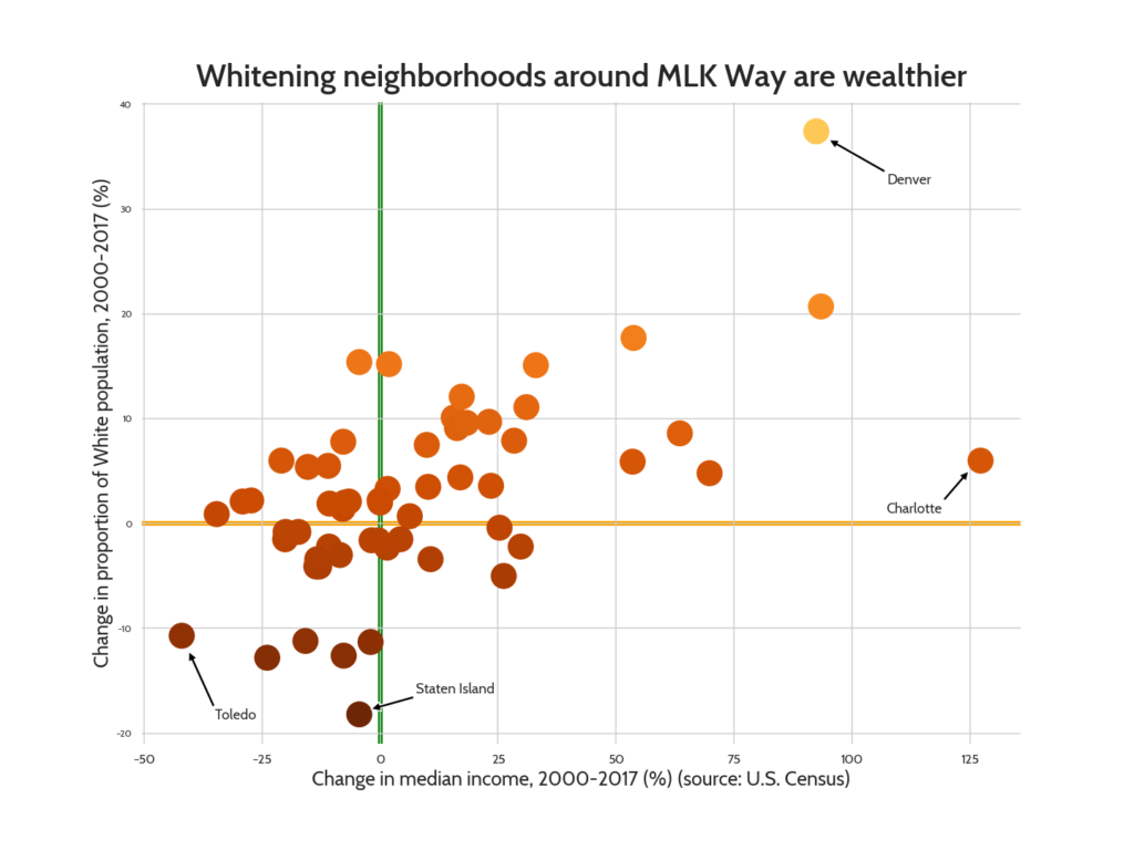
Scatter plot, displaying a correlation between increase in White population and increase in income

MLK Way part 9: Summary data

If you prefer charts to maps, here’s the post you’ve been waiting for; aggregate data for all 58 study cities, with bar charts, scatter plots, sums, medians and correlations. Woot! Interestingly, a number of my field work cities show up prominently in the data.

MLK Way part 8: Obligatory bike content

The Bike Lab began as an attempt to investigate the chicken-and-egg question of whether bike lanes led to gentrification, or gentrification led to bike lanes. In the end I found that the more interesting question was why we came to associate bike lanes with gentrification, given that the strongest predictor of urban cycling in the U.S. is being a low-income ethnic minority. But I can’t do a series on neighborhood change without talking about its relationship to cycling rates.

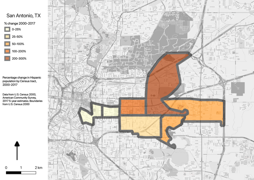
Map showing increase in Hispanic population in San Antonio, by census tract, with northeastern tracts much greater than western tracts

MLK Way part 7: Shifting poverty

To this point I’ve been mentioning only White and Black populations, but the most substantial demographic shifts nationally are among Hispanic populations. There has been a net influx of international Hispanics, and the natural population growth rate is also higher than Whites and Blacks.

As a population, Hispanics are wealthier than Blacks but still far less wealthy than Whites. In many cities, Blacks and Hispanics are now competing for whatever inexpensive housing exists. In these seven study cities, this manifests as an increase in total population, combined with a drop in Black population, a rise in HIspanic population, and a drop in real income.

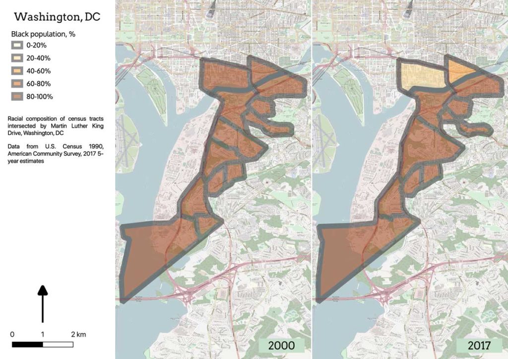
Map of southeastern Washington DC showing changes in demographic composition from 2000-2017

MLK Way part 6: Development without displacement

The Holy Grail of community economic development is “development without displacement”: reinvestment in decayed neighborhoods which can provide long-time residents with new opportunities, without forcing them from their homes. It’s hard to achieve in a market-driven society, especially one where home ownership rates and household wealth are as wildly disparate as they are here in America. But it’s not impossible; six cities in the study qualify.

MLK Way part 5: Resegregation

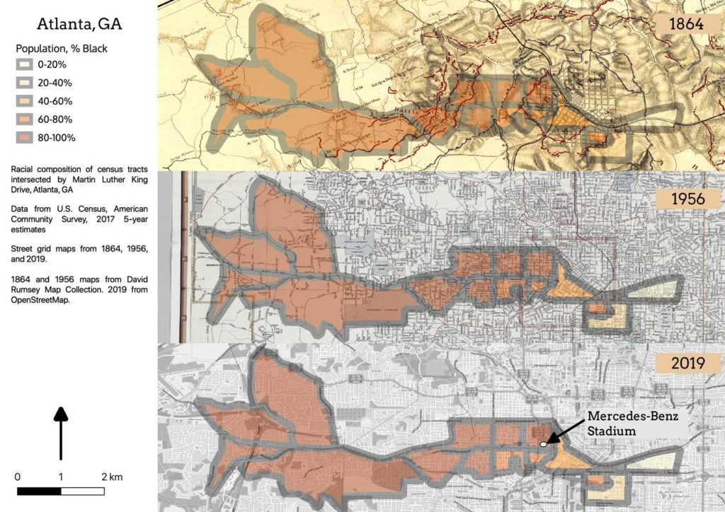
On the eve of the Super Bowl, CityLab posted an article about a neighborhood in Atlanta which was destroyed to build the Georgia Dome, which itself was later destroyed to build Mercedes-Benz Stadium, where the game was played. It so happens that Atlanta’s Martin Luther King, Jr. Drive runs right by the stadium. It being Black History Month, I thought I should dig into the history of the place.

Maps showing Oakland census tracts intersected by MLK Drive in 2000 and 2017

MLK Way part 4: Displacement

The Black Panther Party got its start on Oakland’s Martin Luther King, Jr. Way (then named Grove Street). It was partly fear of the Panthers which led the city to make Grove/MLK the boundary where the elevated BART tracks and the 980/24 freeway would be routed. Anyone living there today can tell you that the neighborhood is one of the most rapidly gentrifying areas of Oakland, which is why it shows up in the group of cities where MLK Way is undergoing displacement: a decrease in Black population and an increase in White population coupled with an increase in median income and other markers of socioeconomic change. This is the most common case in the data set, with 15 cities meeting the criteria.

Map displaying Cleveland census tracts intersected by Martin Luther King Drive, by racial composition

MLK Way part 3: Displacement without development

The most obvious failure of policy is in those neighborhoods which are experiencing “displacement without development”: decreases in both population and income. 12 of the cities in the study fit this profile.

Side-by-side maps of 2000 and 2017 Census boundaries, showing slight differences

MLK Way part 2: Caveats about data

I’m going to be throwing a lot of data out there in this series, so I wanted to start with a few caveats about my process, and about data analysis in general.

Accurately describing the social dynamics of the city through data analysis is a persistent challenge, and the geospatial dynamics aren’t much easier to get at. A simple-sounding question like, “how has the proportion of Blacks in this neighborhood changed over time?” runs into all kinds of problems with the definition of terms and the availability of data.

The Whitening of Martin Luther King, Jr. Way (part 1)

As I’ve ridden around doing field work, I’ve noticed that many cities have a Way, or a Boulevard, or a Drive, or a Parkway, named for Martin Luther King, and that those streets are often located in neighborhoods which were predominantly African-American in the 70s and 80s when the dedications were made. Like gentrification itself, the answer is complex. I generated a lot of rich data to analyze, so this post will be the first of several digging into it. But here’s a teaser.

Scroll to Top