As I’ve worked through this series I’ve had to improve my code to deal with more edge cases. I buffered the street by about 100 meters to smooth out inconsistencies in the census tract boundaries. I wound up splitting out the three New York City boroughs which have MLK Ways, because their stories are very different. I special-cased a few places where the tract selections were not comparable. I had to code for non-reporting Census tracts.
There are probably still some data issues, especially in cities I didn’t build a map for. But overall I’m fairly comfortable with the data set, given the caveats I’ve already raised. The biggest problem I see remaining is that the cost-of-living index is using national numbers, which understate the cost of living changes in expensive metros like Oakland. Some of the cities also have very small sample sizes, especially in the ACS data.
That being said, here are some summaries.
Income
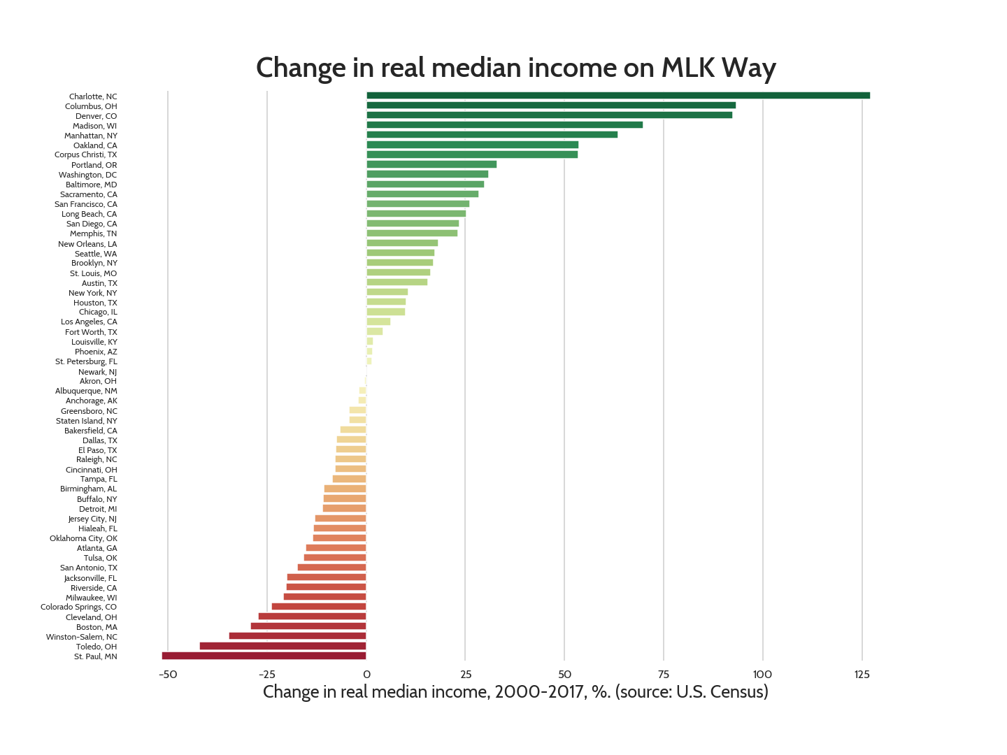
I find two things interesting about the real median income numbers. One is that they are entirely split down the middle: 29 cities are increasing and 29 are decreasing. The average decrease is 0.3%, a mere $72/year. So it’s more or less a wash; the developing cities are evenly balancing out the decaying cities.
The other thing is that the top two cities are Charlotte, NC and Columbus, OH, and the bottom is St. Paul, MN, all of which were part of my field work. That’s not entirely coincidental; the fact that Charlotte and Columbus are expanding is part of why they were selected. But it’s mostly just a cute data point; in all three cities the MLK Way is only a few blocks long, so they show up as outliers partly because the sample size is small.
Population
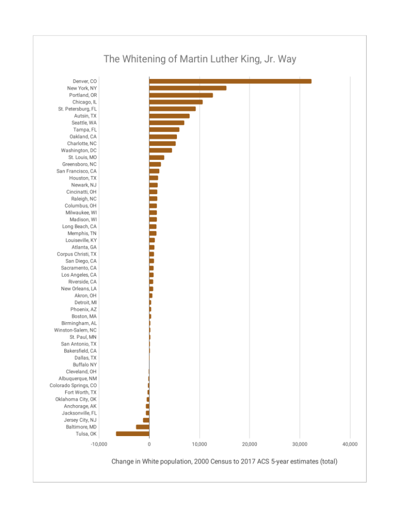
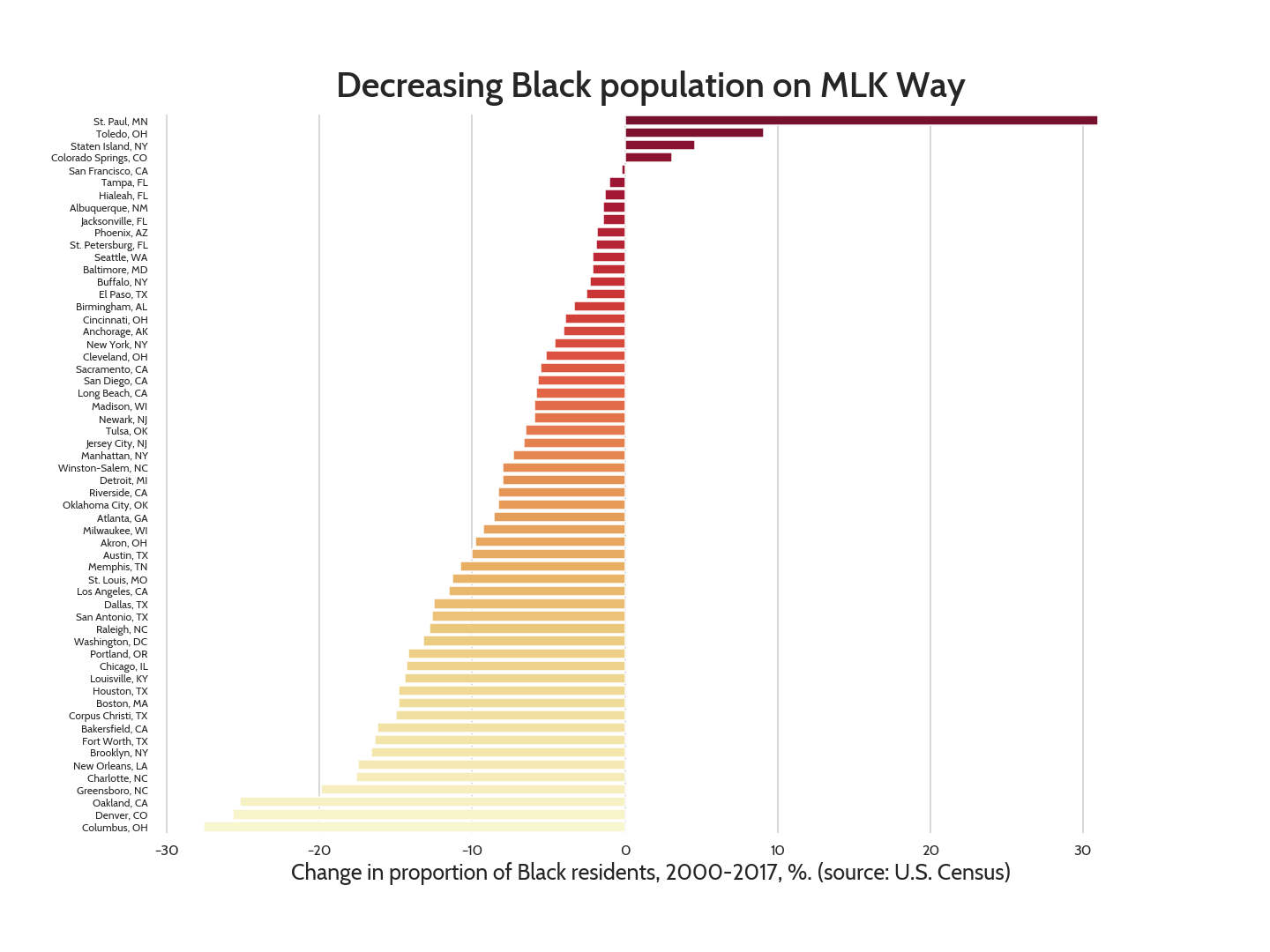
The racial dynamics, on the other hand, aren’t balanced at all; the proportion of Black people in the tracts near MLK Way fell in 55 of 59 cities, with a median decrease of 11.9%. In aggregate, these areas lost 122K Black people.
St. Paul and Columbus show up again; this time as the top and bottom in proportional change. Black population grew by over 30% in St. Paul’s neighborhoods, more than three times the amount of the #2 city (Toledo, OH). Columbus’ proportion of Black people fell by a similar amount (28%). This is a much more common outcome; Black representation fell by more than 10 percentage points in 22 of the study cities.
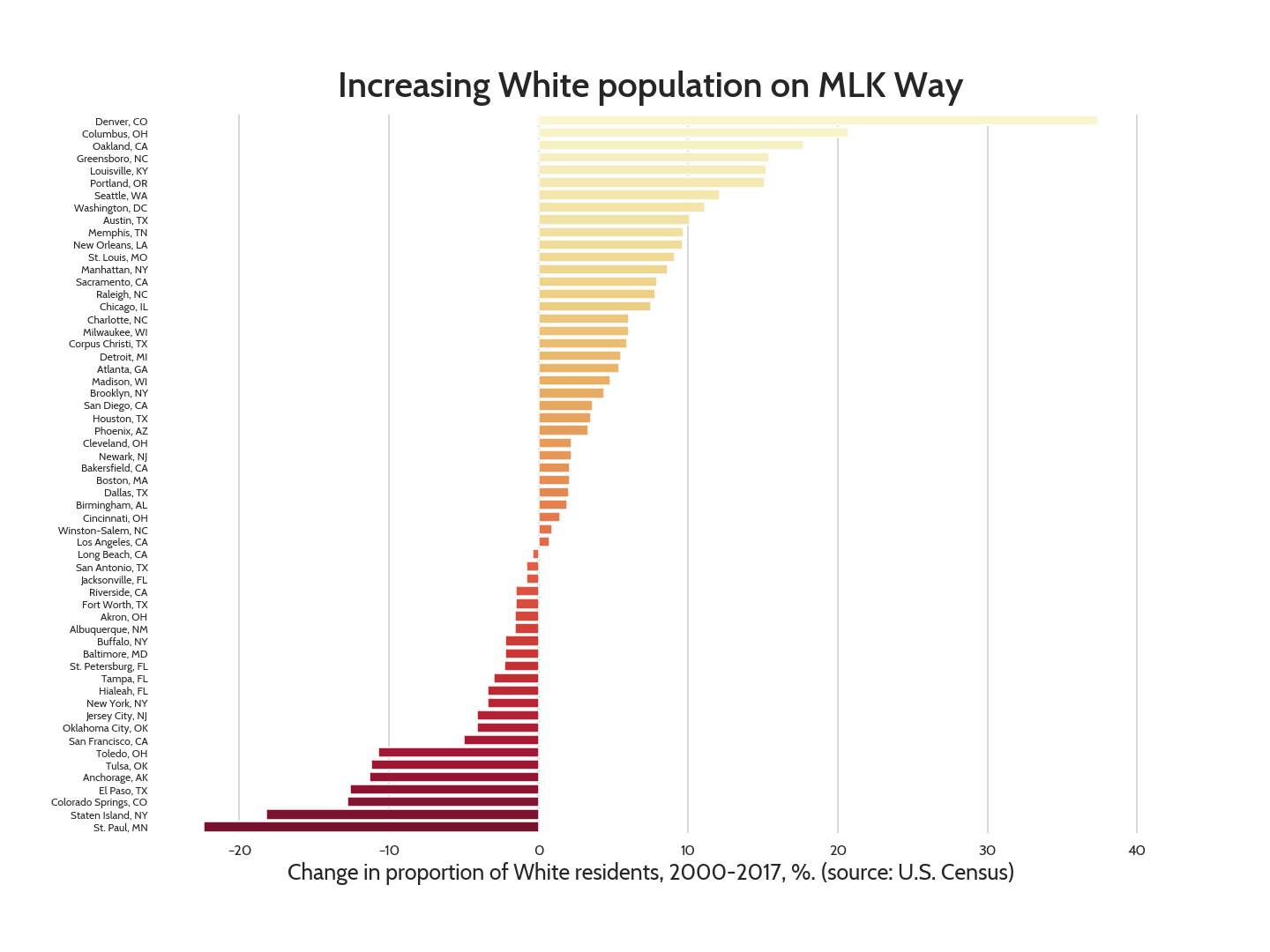
The change in proportion of Whites is not quite so dramatic, though the overall trend is the same. White representation increased by over 10% in nine of the study cities, which gained 101K White persons in aggregate.
The gap between the increase in white people and the decrease in Black people mostly is due to an increase in Hispanic people. Hispanic representation increased by over 10 percentage points in 11 of the study cities, and the total population increase was 98K persons.
Income and population
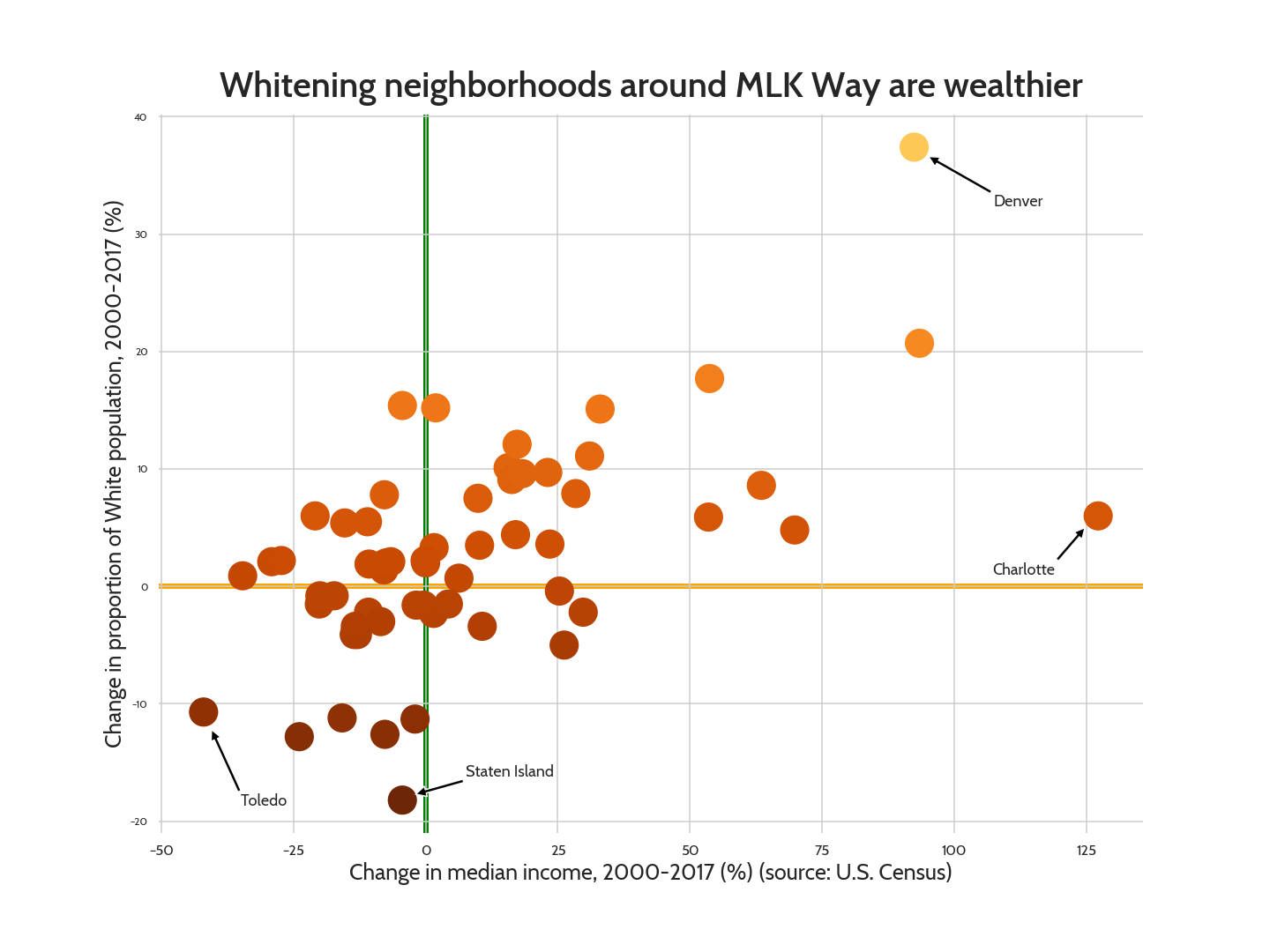
As a whole, income increased where the White population increased. Every city where real income increased by more than 20% also increased in White representation (top right quadrant). Every city where White representation declined by over 10% saw a decrease in income (lower left quadrant). The correlation between the two is regrettably strong (r=0.61).
Note: This chart omits St. Paul to improve the visual display.
Cycling
Returning to the premise of the Bike Lab: Did an increase in White population lead to more cycling? Only a bit. Whiteness is correlated with cycling, but not nearly as strongly as with income (r=0.40). Cycling rose overall (by 0.5 percentage points), but there are cities like Columbus where White representation rose by over 20 percentage points while cycling rates went down.
Note: This chart omits Portland to improve the visual display.
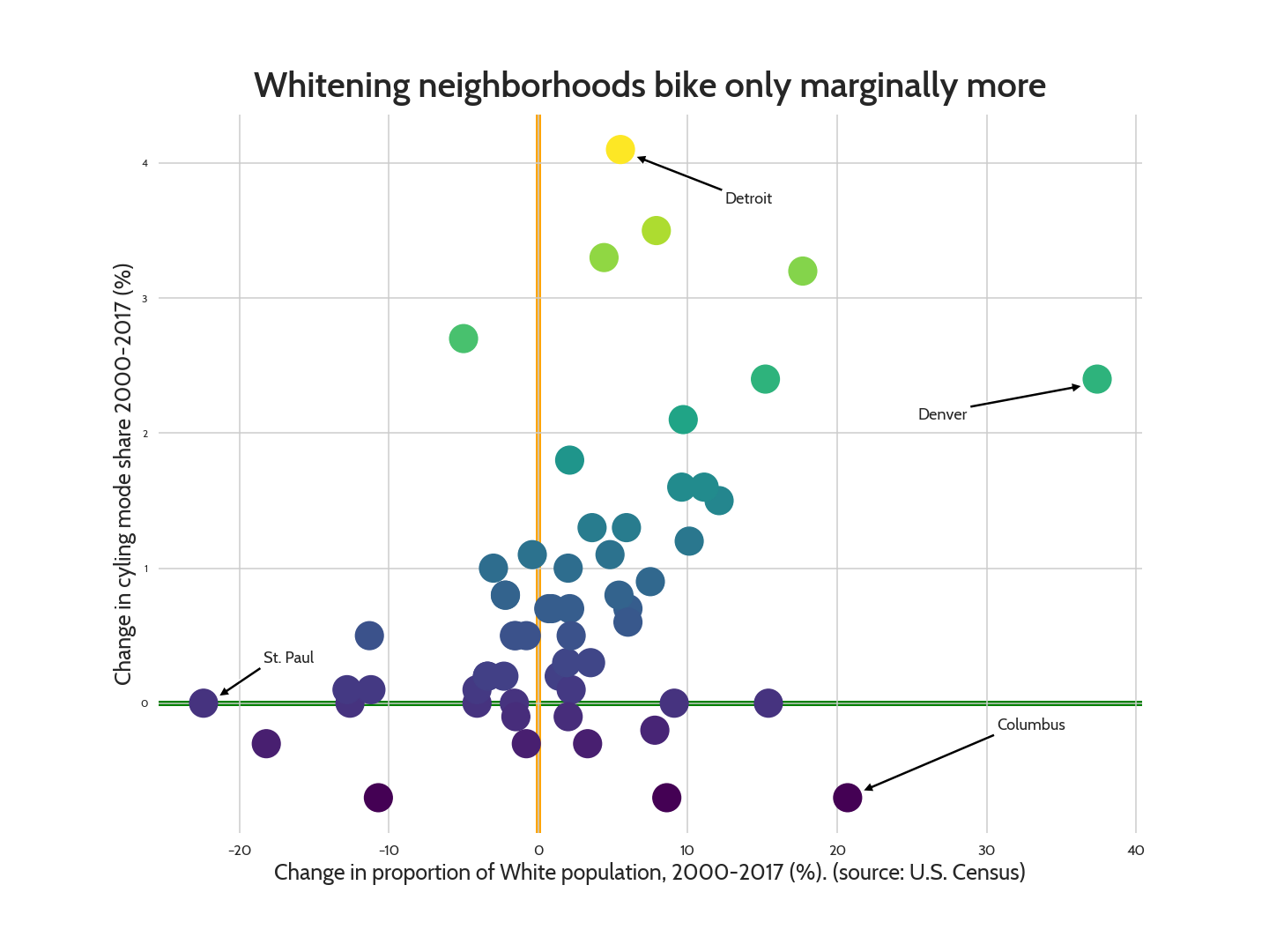
When I visited Columbus I stayed not far from MLK Blvd. That eastern area of town does face some real barriers to cycling; getting to downtown requires a harrowing freeway crossing and a jaunt on a one-way high speed three-lane road. So that might explain why cycling didn’t increase, but it doesn’t really explain why it decreased. My hypothesis would be that white people view poor infrastructure as more of a barrier to cycling than Black people do.