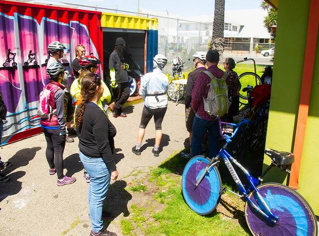
I’m going to be leading a bike tour of Oakland’s flatland neighborhoods this weekend, and in preparation I did some work on redlining maps. One of the themes of the ride is that the current racial divisions between neighborhoods is largely a function of housing policies and practices in the post-Depression era.
Here are two maps I developed to look relatively comparable. The first is based on the 1937 redlining maps of Oakland. The second is the census tract demographic breakdown, by percentage who identify as White only. The maps look spookily similar.
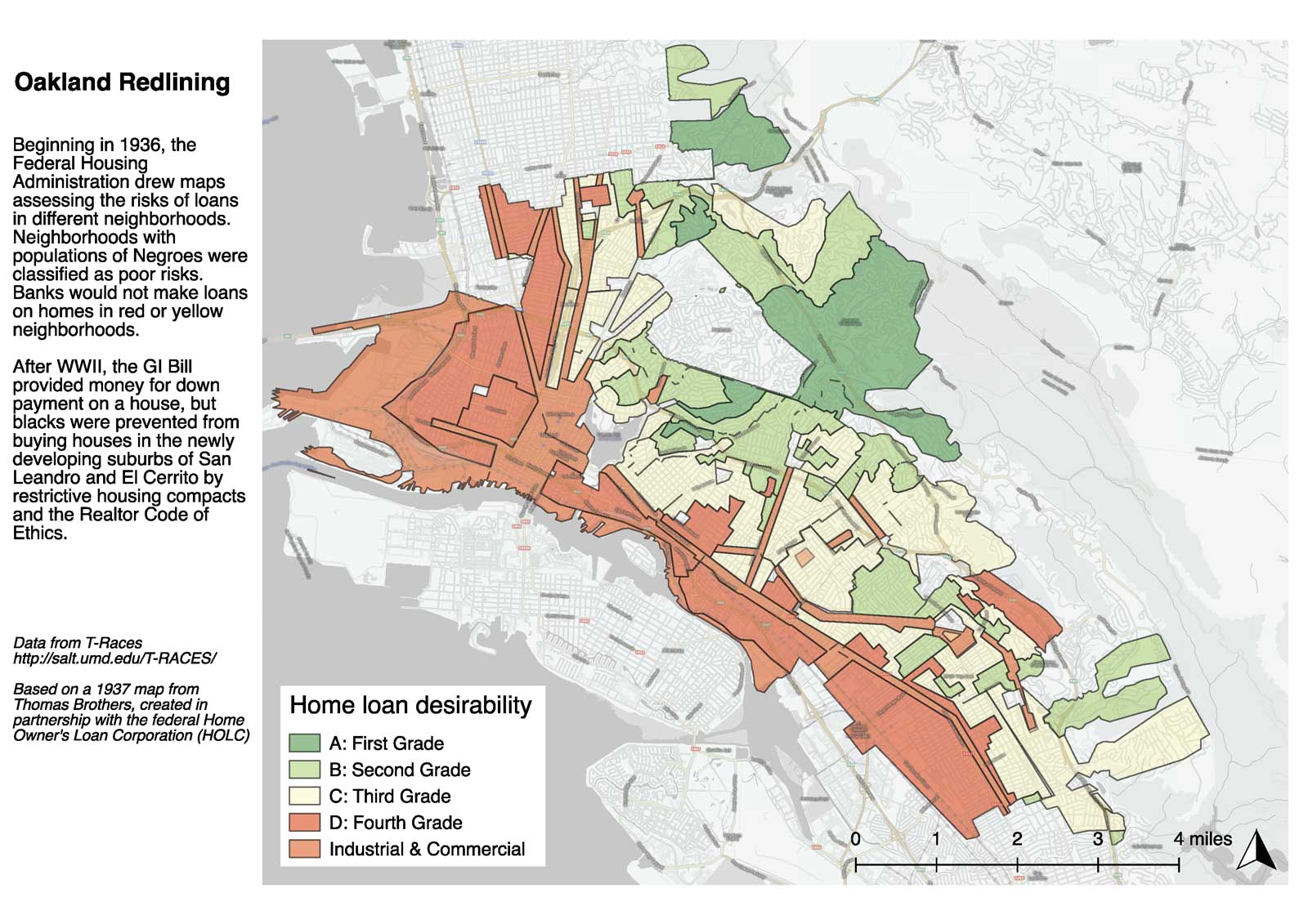
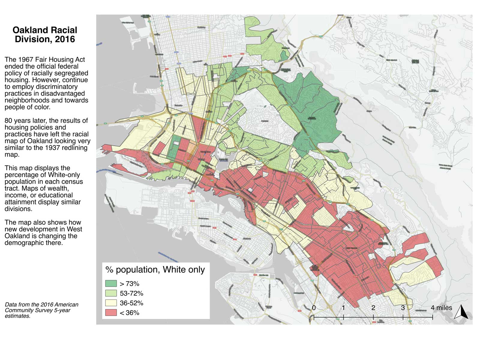
The biggest distinction is that East Oakland is a lot less white (due to disinvestment over the ensuing 80 years), and West Oakland is surprisingly white (due to reinvestment/development over the past 10 years).
Personally, I believe that a bike trip through the city is the best way to experience the differences between neighborhoods. It also can highlight the critical role that infrastructure plays in dividing communities.