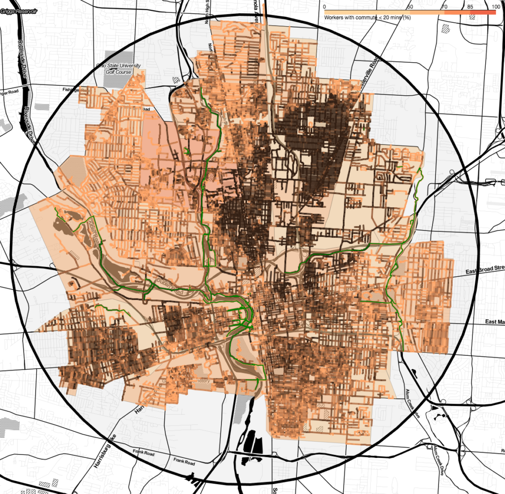
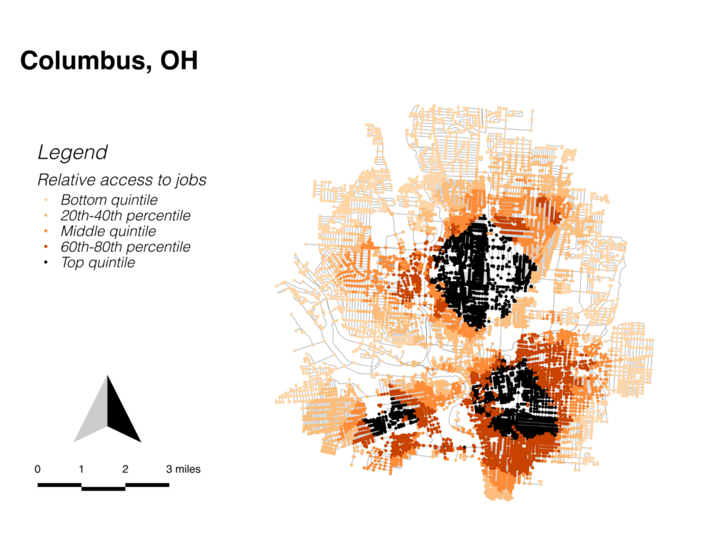
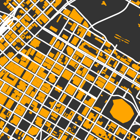
Thesis work

Map output

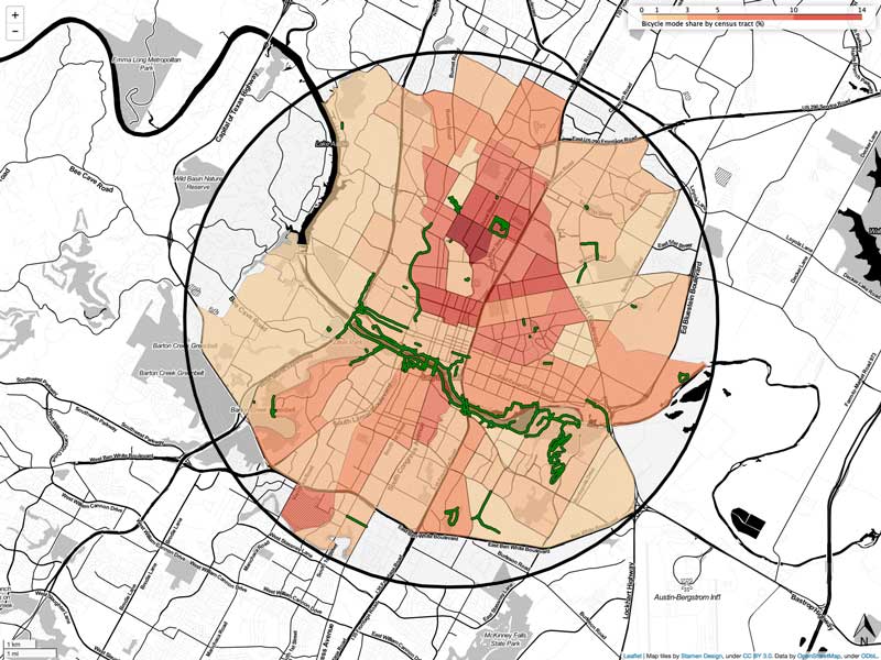
It’s not entirely perfect yet, but I have a workflow which generates these maps right out of Python for all of my cities, with some provision for longitudinal comparisons. To do still are to deal with projection issues (they’re all in “web Mercator” because that’s what Leaflet uses), and centering issues caused by inconsistencies between folium, selenium, and PhantomJS. And to improve legends and captions. But it’s pretty cool, if you ask me.

Auto-generating maps

I’m working on scaling up the data analysis from the thesis, and I’m making some good progress, thanks to Folium. I’m pretty close to being able to run this on an arbitrary number of cities: just need to make the code a little more robust.

Whoops

I’ve been working on generalizing my code so that I can make comparisons for dozens (or hundreds) of cities. And of course, I’ve found a ton of bugs, mostly related to my own poor understanding of Python data structures and functions. But I also found a fundamental issue with the calculations I used in my thesis.

Distance thresholds

After looking at the job connectivity maps, I was curious to explore the idea that densities above a certain level led to walking more than cycling. I don’t have enough data to make a definitive statement, but I did find an interesting phenomenon related to connectivity in Columbus. Columbus has three disconnected zones where jobs are very close, broken up by areas of low job access.

Image depicting river systems with three different drainage densities (fine, medium, and coarse)

Intersection density

OSMnx makes it easy to generate statistics on street networks. Again these aggregated stats show very strong correlations, especially between bike mode share and intersection density. One of the problems of cycling advocacy is that there’s often not much that can be done to change this indigenous condition.

Density = destiny?

One striking result from the target area analysis is the correlation between residential density and cycling rates in the target area. For these four data points, the correlation between density and bicycle mode share is dramatic (r=0.97), which seems to speak to the importance of indigenous conditions in people’s mode choices. Unfortunately, the effect disappears when examined at the census tract level.

Scroll to Top