Map of Oakland showing median income. All of East Oakland is shaded in red (less than $50K) or orange ($50-$100K). The hills to the north are in blue (>$200K) , while the areas further east and south trend to green and yellow ($100-$200K)

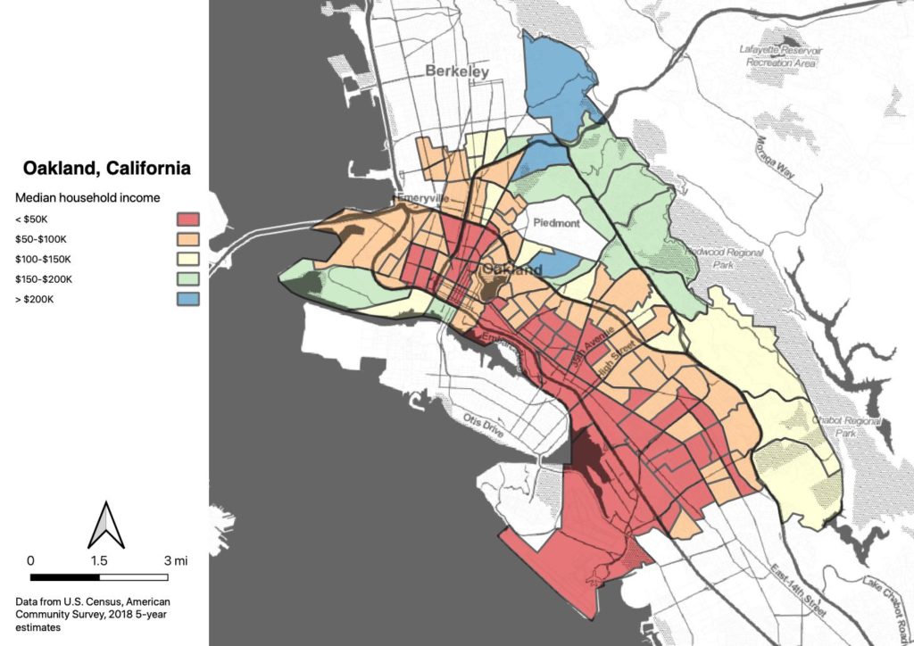
Oakland neighborhoods

I’m going to be leading a bike tour of Oakland’s flatland neighborhoods this weekend, and in preparation I did some work on redlining maps. One of the themes of the ride is that the current racial divisions between neighborhoods is largely a function of housing policies and practices in the post-Depression era. 

Crushed bicycle after collision with Uber autonomous vehicle

Smarter cities?

The recent autonomous vehicle fatality in Arizona highlights some of the philosophical issues which our societies will need to grapple with as we transition to the post-driving world. Technical developments will allow autonomous vehicles to outperform human drivers, but the surrounding moral issues still remain to be addressed.

Map output

It’s not entirely perfect yet, but I have a workflow which generates these maps right out of Python for all of my cities, with some provision for longitudinal comparisons. To do still are to deal with projection issues (they’re all in “web Mercator” because that’s what Leaflet uses), and centering issues caused by inconsistencies between folium, selenium, and PhantomJS. And to improve legends and captions. But it’s pretty cool, if you ask me.

Auto-generating maps

I’m working on scaling up the data analysis from the thesis, and I’m making some good progress, thanks to Folium. I’m pretty close to being able to run this on an arbitrary number of cities: just need to make the code a little more robust.

Whoops

I’ve been working on generalizing my code so that I can make comparisons for dozens (or hundreds) of cities. And of course, I’ve found a ton of bugs, mostly related to my own poor understanding of Python data structures and functions. But I also found a fundamental issue with the calculations I used in my thesis.

Distance thresholds

After looking at the job connectivity maps, I was curious to explore the idea that densities above a certain level led to walking more than cycling. I don’t have enough data to make a definitive statement, but I did find an interesting phenomenon related to connectivity in Columbus. Columbus has three disconnected zones where jobs are very close, broken up by areas of low job access.

Scroll to Top