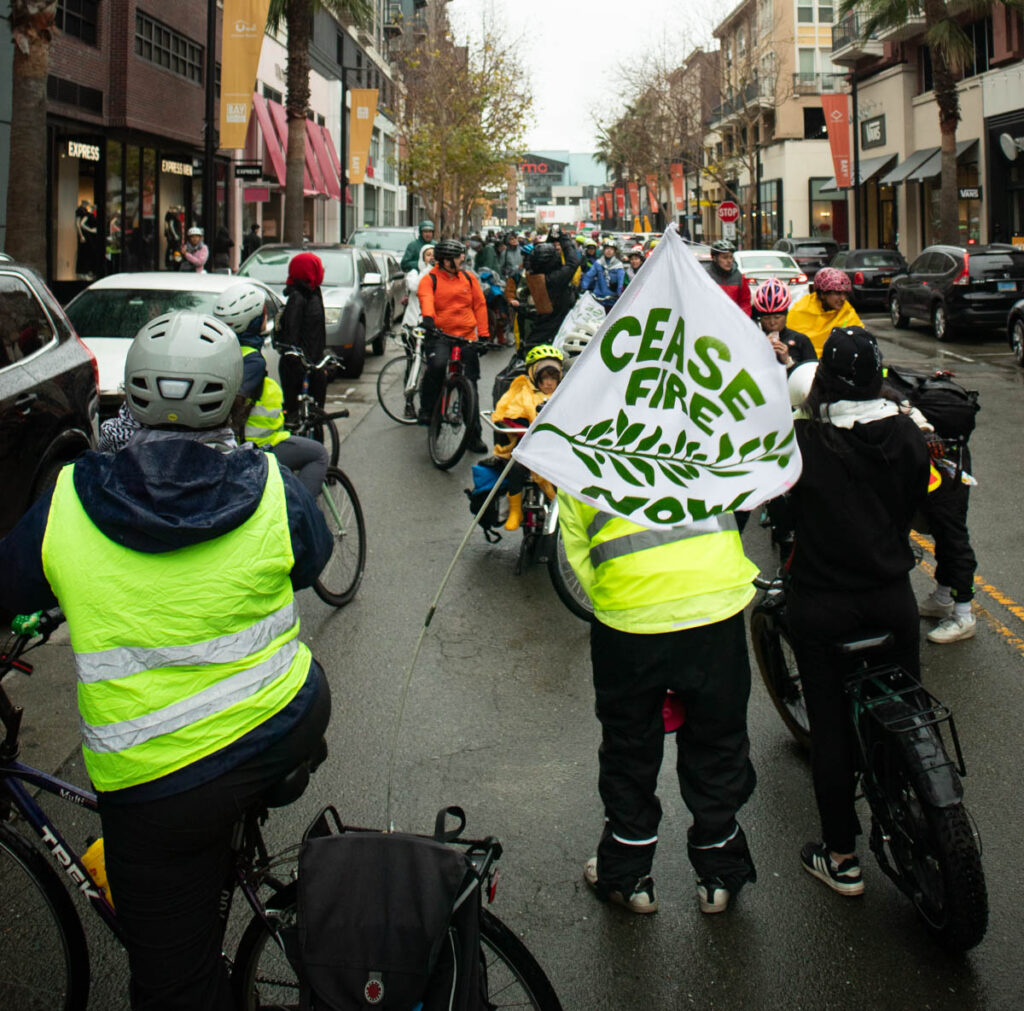
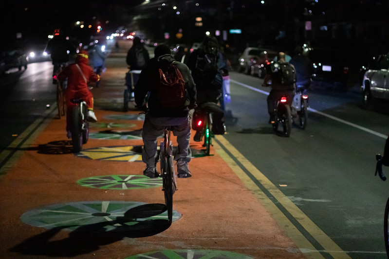
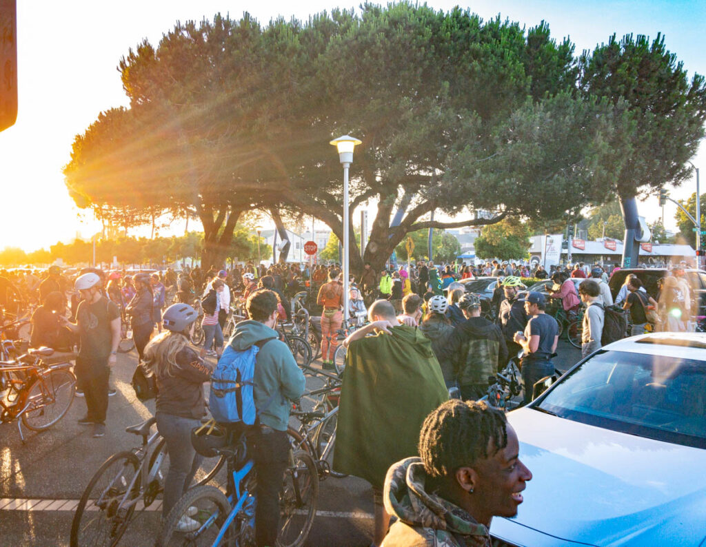
Map of Oakland showing the Metropolitan Transportation Commission's Communities of Concern. Deep East Oakland and parts of downtown and West Oakland are mostly dark purple (Highest concern). A few areas in Deep East, and much of Fruitvale is lighter purple (Higher concern). Most of the rest of the flatlands are light purple (High concern). The hills are uncolored (Low concern).

Compromised

Public-private partnerships require compromises. Compromises on terms are natural in such negotiations, but I am concerned with compromises on principles. There are two ways cities compromise their principles in public-private partnerships: bullshit requirements, and bullshit enforcement.

Group of 20 cyclists riding at night on wide road, with center lane painted orange with colorful wheel graphics. The cyclists are taking the right and center lanes. Lights of cars are seen both approaching and going away.

Scraper Bike Halloween ride

I got to spend Halloween with the Original Scraper Bike Team, and it reminded me of why I enjoy riding with them and supporting them, and also, why it’s important.

Racially-biased policing in Oakland (updated with 2019 data)

The Oakland Police Department is legally required to provide racial data on police stops. But they’re not required to make it easy. But they finally released their report.

We don’t have detailed public data on where the stops are occurring, only the police beat. I did some hacky stuff to estimate the racial composition of each police beat using Census data, and tested whether the stops were proportional to the racial makeup. As you might guess, the answer is “no.” In 2019, the problem was marginally better, but it’s still a problem.

Collection of Chicago (North Lawndale) maps

I’m working on a series of maps of Chicago’s North Lawndale neighborhood. I’m just going to drop a bunch of drafts into this post to share with the team.

Map of Chicago, showing Burgess' concentric-circle zone model on top of the FHA redlining map for Chicago. Nearly all of zone 2 (zone in transition) and zone 3 (zone of workingmen's homes) were redlined. Zone 4 (residential zone) is mostly yellow, and zone 5 (commuters zone) is mostly green and blue.

Burgess concentric circle map in GIS

I’m going to be doing some mapping for a project from Equiticity, and one of the themes will be historical spatial inequities in Chicago. This got me thinking about the highly influential concentric-circle city development map drawn by Ernest Burgess (Chicago School of Urban Sociology) in 1925.

Surprisingly I couldn’t find a usable GIS representation of his drawing. So I decided to work on my georectifying skills and put one together.

You can see how Burgess’ racist ideas led directly to racist housing policies.

Map of Los Angeles County census tracts, colored by percentage of Black population, overlain with Metro Bike Share system coverage.

Assumption of equity

I see advocates assume that the projects that they advocate for will address issues of historical inequities. A thread on distributing bikes in LA led me to investigate whether LA Metro bike share is equitably distributed. Bike share does not reach the Black areas of the city at all; in fact, there’s not a single bike share station located in a census tract that is even 25% Black.

Scroll to Top